Company
CGI
|
Client
Top 10 US Bank
Some details under NDA
How I rebuilt 2,200+ Sketch symbols as Figma components
Late in the retail banking modernization project, the client switched design tools from Sketch to Figma and relied on me to rebuild 3 design systems in less than 5 months. Thousands of work hours and millions of dollars were at stake if I failed.
Overview
Team
3 Leadership Stakeholders
3 Retail UX Designers
2 Wealth UX Designers
2 Mobile UX Designers
⭐️ Me (Retail UX Designer)
My Role
Senior Product Designer
Design Systems
Timeline
5 Months
Project Overview

In early 2024, right in the middle of a mobile app redesign and just a few months away from launching retail web banking to customers, the bank decided to switch from Sketch to Figma. The timing was tricky.
The Big Problem
Teams still had to meet tight deadlines, and would also have to wait for the design system libraries to be published, further delaying the migration to Figma.
As a contractor, I was able to access Figma with my company account and so was tasked with rebuilding the bank’s 3 core design systems ahead of time:
Retail
Supports the online banking experience 12M+ customers with net worth under $1M
Wealth
Retail’s sister design system supporting wealthy clients with high net worth
Mobile App
App supporting both Retail and Wealth customers
More Problems
Delivering the 3 libraries on time was key to keeping 2 major releases on track, avoiding delays that could have cost the business significantly. In addition, I continued maintaining and supporting the Retail design system and its user base of 25+ product teams.
I also had to learn Figma.
Results and Impact
100% of components for all 3 systems were rebuilt, tested, and delivered on time
Key Metrics
1,000+
Total Figma components and page templates across 3 design systems
50%
Reduction in the number of Sketch symbols
28,800+
Estimated work hours saved by rebuilding the libraries ahead of time
🚀 Post-Launch
Because I built the design systems ahead of time, design teams were able to use the new components the first day the bank gained access.
The Figma components are used by:
3
Design Systems
30+
Product teams
70+
Designers
200+
Developers
I led Figma training and mentored design teams across web and mobile platforms
Design system teams
- Scheduled file handoff meeting with Wealth and Mobile designers to train them on their new libraries
- Set up weekly check-ins for 6 weeks with the Wealth team
- Made time in my schedule for ad-hoc meetings if they felt stuck
- Gave 2+ component demos at Wealth and Mobile office hours to help support their users and answer library specific questions
Product teams
- Gave at least 6+ Figma demos at the Retail weekly office hours attended by up to 60+ designers and developers
- Helped establish a dedicated Figma support help desk Teams channel to better track questions and feedback
- Weekly support meeting with a design pod of 4-6 designers
- 1:1 meetings with designers as needed
Testimonial
Amelie H.
Product Designer
As a product designer using the system, Susan was an ideal teammate. Beyond informative practice-wide weekly sessions, she took the time to meet with our smaller design pod at another time each week.
Early in the process, we often rolled through long lists of edits and requests, and she took every one of our comments and questions and worked to improve the design system. Nothing was too small or too big for her to be concerned about.
Read Full Review
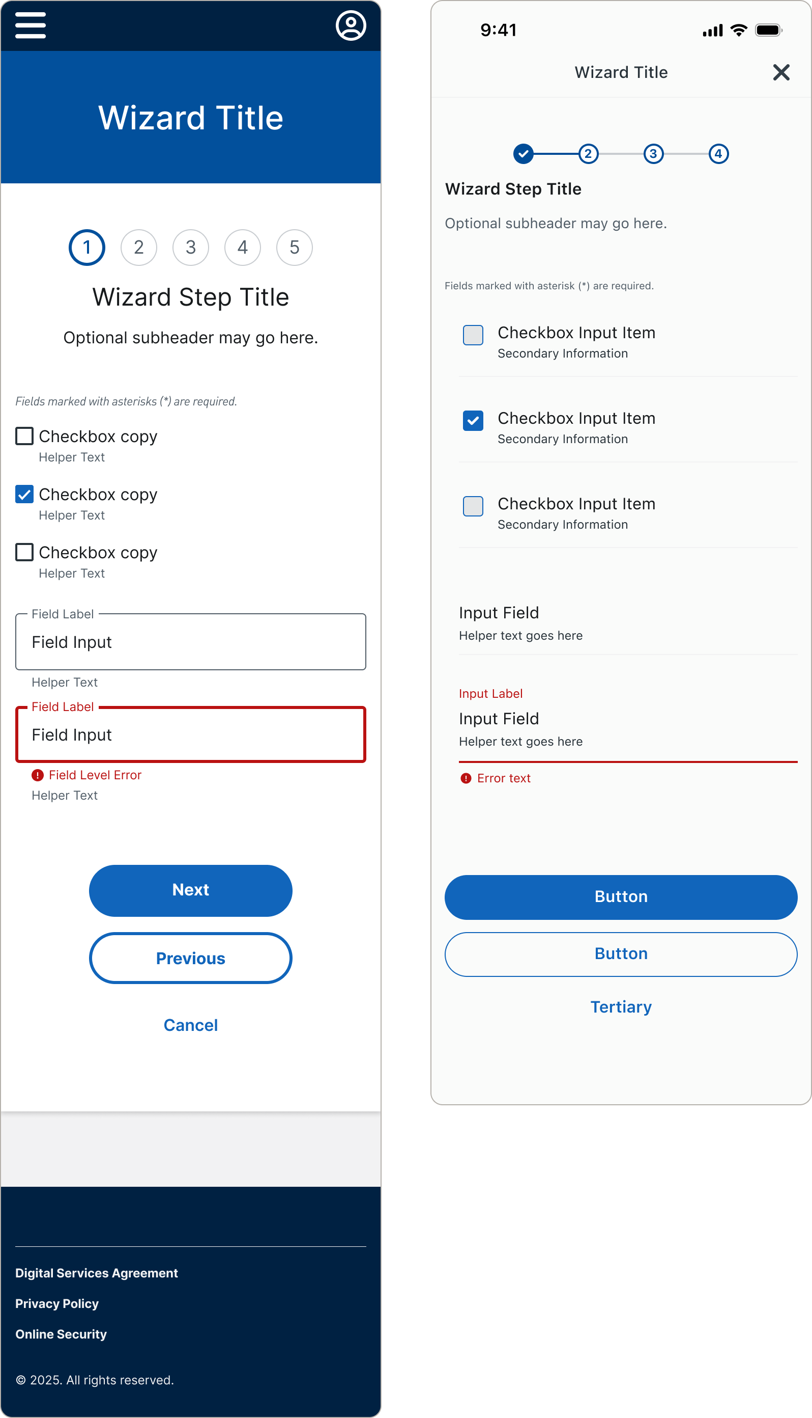
Improved construction of the Figma components nearly eliminated common spacing issues we would see in design reviews with Sketch
For example, I built page templates, such as multi-step wizard forms, to include common design patterns that were missing from Sketch.
On the Retail design system team, we saw nearly an 80% reduction in the number of spacing issues we identified during design reviews when designers used the page templates, compared to what we saw with Sketch.

Before
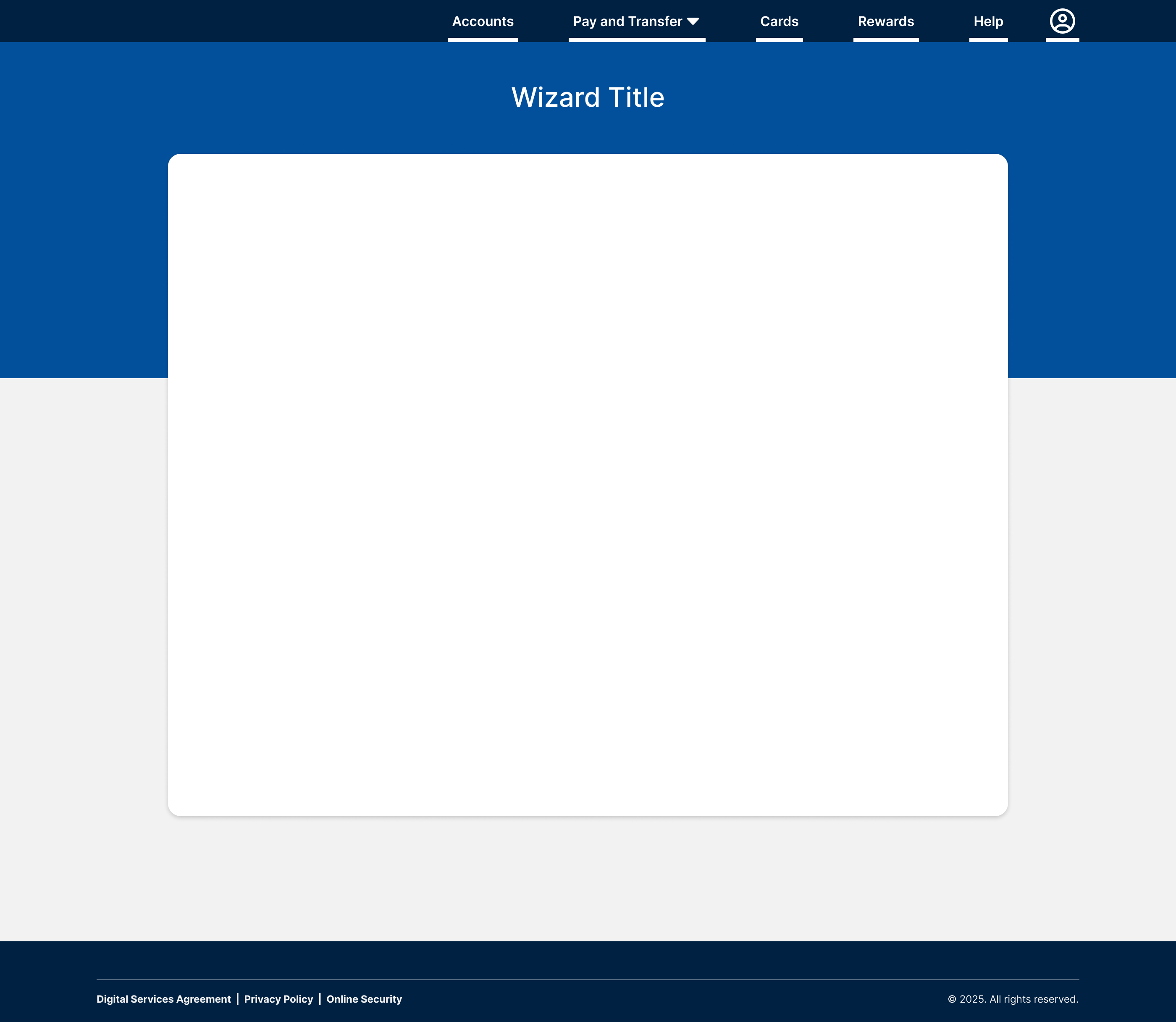
- Multi-step wizard form templates didn’t include examples of common form patterns such as the title/step counter and button stack
- Spacing needed to be set manually, which led to inconsistency in code
- Top navigation tabs were selected by default, contradicting design standards that forms do not show selected tabs, requiring manual work to remove
After
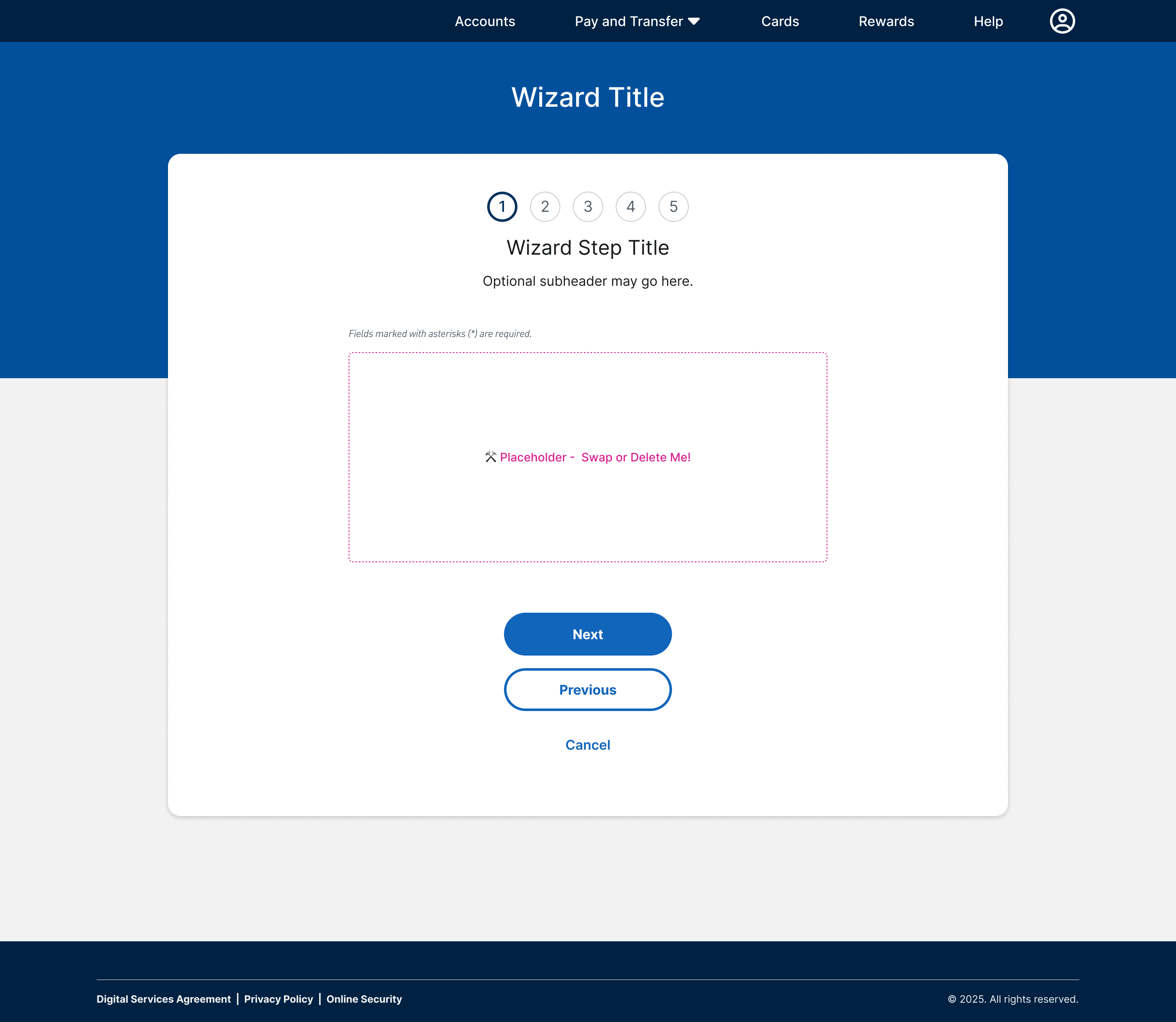
- Common form patterns are baked into the wizard templates and include variants to support a wide range of use cases
- Max width is defined at the container component level ensuring when the placeholder is swapped, content stays the correct width
- Navigation is built with the tabs off by default to match standards and prevent unnecessary manual work
Because of my success delivering 3 design systems on time, I was asked to build 2 additional design systems a few months later
Legacy Mobile App Library
150+ Components
Responsive Web View Themed Library
40+ Components
Although the legacy mobile app library was originally descoped from the Figma migration, it suddenly became a priority months later when new features needed to be added. A few months later, the responsive web view library, also previously descoped, was needed in a few weeks. I rebuilt both libraries each under a month, all while continuing my regular work on the Retail design system.
Ultimately, the design systems support the modernization of the digital banking experience, which will reach 12 million customers across the US after the final customer launch wave is completed, estimated fall 2025.
Nearly a year later, the components have more than
2.2 Million
inserts combined across the 3 Figma libraries
Less than
1%
were detached
Process
May 2024
Project Kickoff and Audit
- Define scope with stakeholders
- Initial timeline 8 weeks
- I audited the Sketch libraries then created a weekly roadmap
Initial Deadline
August 2024
Week 1-15: Figma Conversion
- Started with foundations, then progressed from simple to complex components
- Biweekly progress review meetings with systems designers
- Finalized design tokens
Actual Deadline
Late October 2024
Testing and File Handoff
- Figma component QA testing
- Transferred library files to client’s Figma
- I provided support and training to the design systems teams
Figma Access
Nov 2024
Project Kick-Off
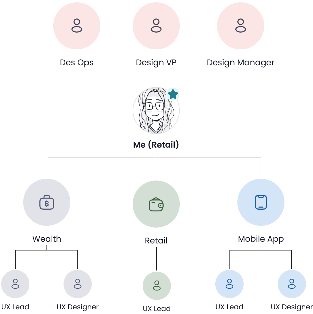
To kick off the project, I met with 3 members of design leadership and representatives from each design system to prioritize the components and determine the timeline. The initial scope was one 2 week sprint to audit the Sketch libraries and 8 weeks to rebuild all 3 systems.
Leadership and Design System Reps
Des Ops
Design VP
Design Manager

Me (Retail)
Mobile App
UX Lead
UX Designer
Wealth
UX Lead
UX Designer
Retail
UX Lead
Challenges
Getting stakeholder buy-in for rebuilding the components differently in Figma
Stakeholders were concerned that the new approach to building components would be too difficult for designers to learn while they were juggling file rebuilds and new projects.
To ease their worries, I set up regular meetings with leadership to show them how Figma's features like auto layout made component building more intuitive and efficient, ultimately saving design time.
Due to working in siloed teams, I lacked visibility into the other 2 systems
The symbol audit was the first time I had opened the Wealth and Mobile files. There were some points of confusion such as unorganized symbols, and confusing color style naming.
To ensure the new components matched expectations, I established biweekly check-ins with the Wealth and Mobile teams. I reviewed my open questions and made recommendations for improving their components while taking their feedback and needs into consideration.
The Wealth system had not finalized their new colors
Wealth had decided to align to the new color system several months after Retail and Mobile finalized the new color ramps, which was shortly before the Figma rebuild project started. By the time I started rebuilding the libraries, Wealth had not fully set up their color design token structure.
This was a huge blocker for me to set up their Figma color variables, which I needed to get in place prior to building their components.
To make things more complicated, their existing system had several instances of one-off color styles and floating HEX values, with some cases of inconsistent color usage across similar symbols.
I solved these issues by:
- Looking at their system holistically to identify similar colors and opportunities for consolidation
- Mapping their brand-specific colors to our new color token pairing system based on Material’s color roles, improving organization
- Presenting the updates to the Wealth team for feedback during our check-ins to ensure we were on the same page, iterating as needed
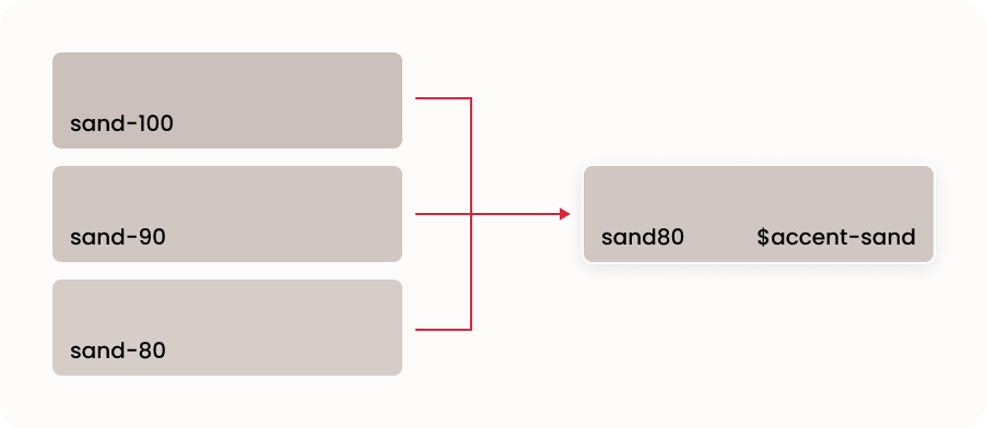
Example of how I consolidated similar existing Wealth colors to the new color ramp system and as a single design token.
Sketch Library Audit
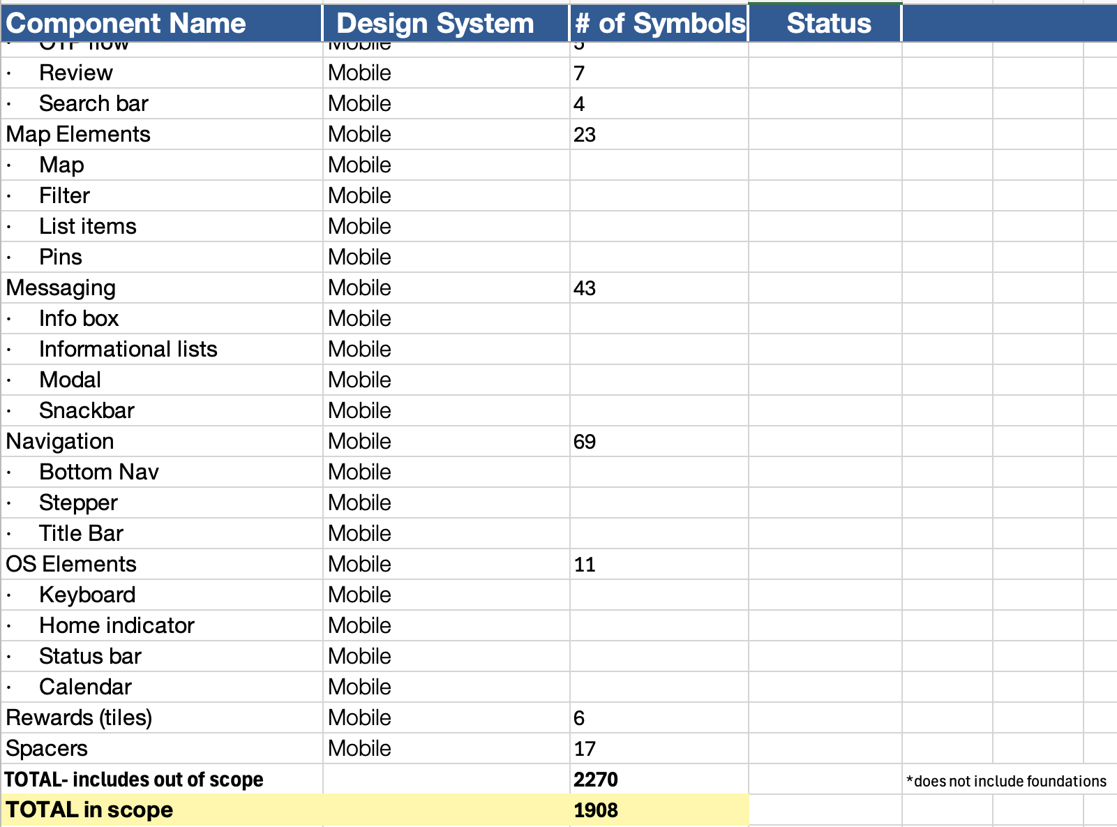
I catalogued all symbol categories in a spreadsheet to quantify what would need to be delivered.
Due to the short timeline, I advised stakeholders to remove page templates from scope, since they could be assembled from existing components. This minimized risk, ensuring design work could continue even if templates were delayed - unlike core components, where delays could impact entire project deadlines.
Excluding colors and type styles...
There were almost 2,300 Sketch symbols 😱
I estimated that I could reduce this by at least 30% in Figma.
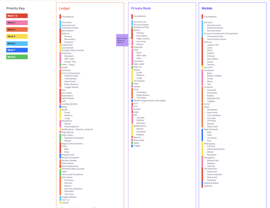
I created a checklist template to track weekly progress for each design system
Retail
Wealth
Mobile
I listed out the component categories by system, then tagged them by week, starting with foundations, then working from simple to complex components.
I rebuilt the 3 systems at the same time because it was easier to track. Additionally, the Wealth design system shared approximately 70% of components with Retail. I set up their foundations, then decided to wait until Retail was mostly built out and clone the library to save time.
Week 1
Retail Web
Naming convention and folder structure
Set up foundations
- Color roles
- Typography
- Grid styles
- Icons
- Spacing
- Elevation
- Illustrations
Buttons
Wealth
Naming convention and folder structure
Set up foundations
- Color roles
- Typography
- Grid styles
- Icons
- Spacing
- Elevation
- Illustrations
Wealth shares many common components with Retail Web and will be built as a clone of that file when progress has been made
Mobile
Naming convention and folder structure
Set up foundations
- Color roles
- Typography
- Grid styles
- Icons
- Spacing
- Elevation
- Illustrations
Buttons
Card Art
Example checklist for the first week

The Components
Global Color System
Before starting design system work, I set up the color library with our new global (or primitives) color system, which would be aliased by all 3 systems as color roles.
100
98
95
90
80
70
60
50
40
30
20
10
0
Prior to the Figma rebuild, I led the effort to create a shared color ramp library and align the 3 design systems to one scalable color system (case study coming soon).
Foundations
Next, I continued with local foundational tokens - color role variables, typography, grids, and other styles, integrating the new design token naming conventions for Retail and Wealth (Mobile had their own token system established prior to our token working sessions. We were able to align color role naming for the 3 systems but are otherwise not aligned in foundational tokens).
Color Role
$primary
$on-primary
$on-surface
$on-surface-variant-low
$outline
$confirmation
$attention
$error
Retail Value
blue40
neutral100
neutral10
neutral40
neutral90
green50
yellow80
red40
Mobile Value
blue40
neutral100
neutral10
neutral40
neutral95
green50
yellow80
red40
Wealth Value
azurite20
neutral100
neutral10
neutral40
neutral90
green50
yellow80
red40
Scroll to view full table
Some common color roles used across the 3 systems, based on Material 3’s naming convention. They are approx. 75% aligned on naming and colors used, but there are a handful of differences, including the primary color.
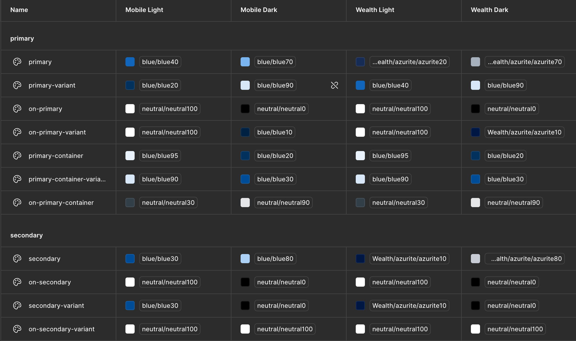
Mobile was the only one of the systems that needed to support theming - light and dark mode for 2 different brands - Retail and Wealth.
Because mobile was undergoing a redesign, they already had a token structure in place in their code. Due to tech constraints at the time, Retail Web and Wealth were not ready to fully implement design tokens except colors, so their spacing tokens in Figma were limited to primitives (the base level of design tokens that reference a raw value).
Retail
Wealth
Name
space-050
space-100
space-150
space-200
space-300
Value
5 px
10 px
15 px
20 px
30 px
Mobile
Name
padding-xs
padding-small
padding-medium
margin-large
gutter-small
Value
4 px
6 px
8 px
16 px
20 px
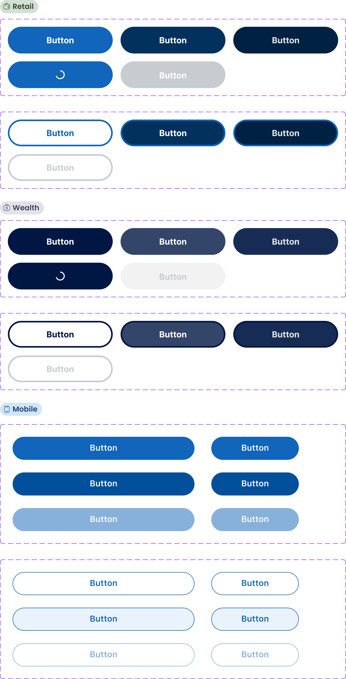
Base Components
Like Building Blocks, these components are made up of combinations of design tokens. They may also include some nested building block elements (such as error text in a text input). I built in basic prototyping functionality (such as hover and selected states) where applicable.
Jumbo
$on-primary
$primary
headline-large
Jumbo
padding-medium
padding-xxl
Building Blocks
Building block components are made up of various design tokens (Figma variables) or nested base components. Some building blocks are also complex components with other nested components that are in turn nested within page templates.

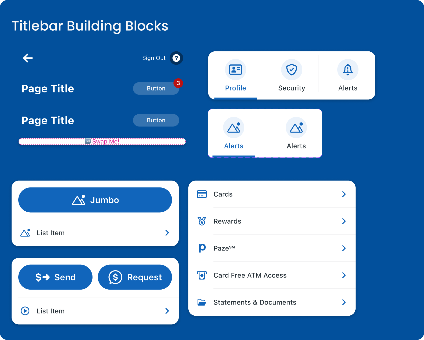
Retail global navigation component is made up of building blocks for icons and menu items.
Building blocks allow flexibility in the system when designers are trying something new.
They are also important for supporting breakable complex components and page templates to ensure designers are still linked to the library.
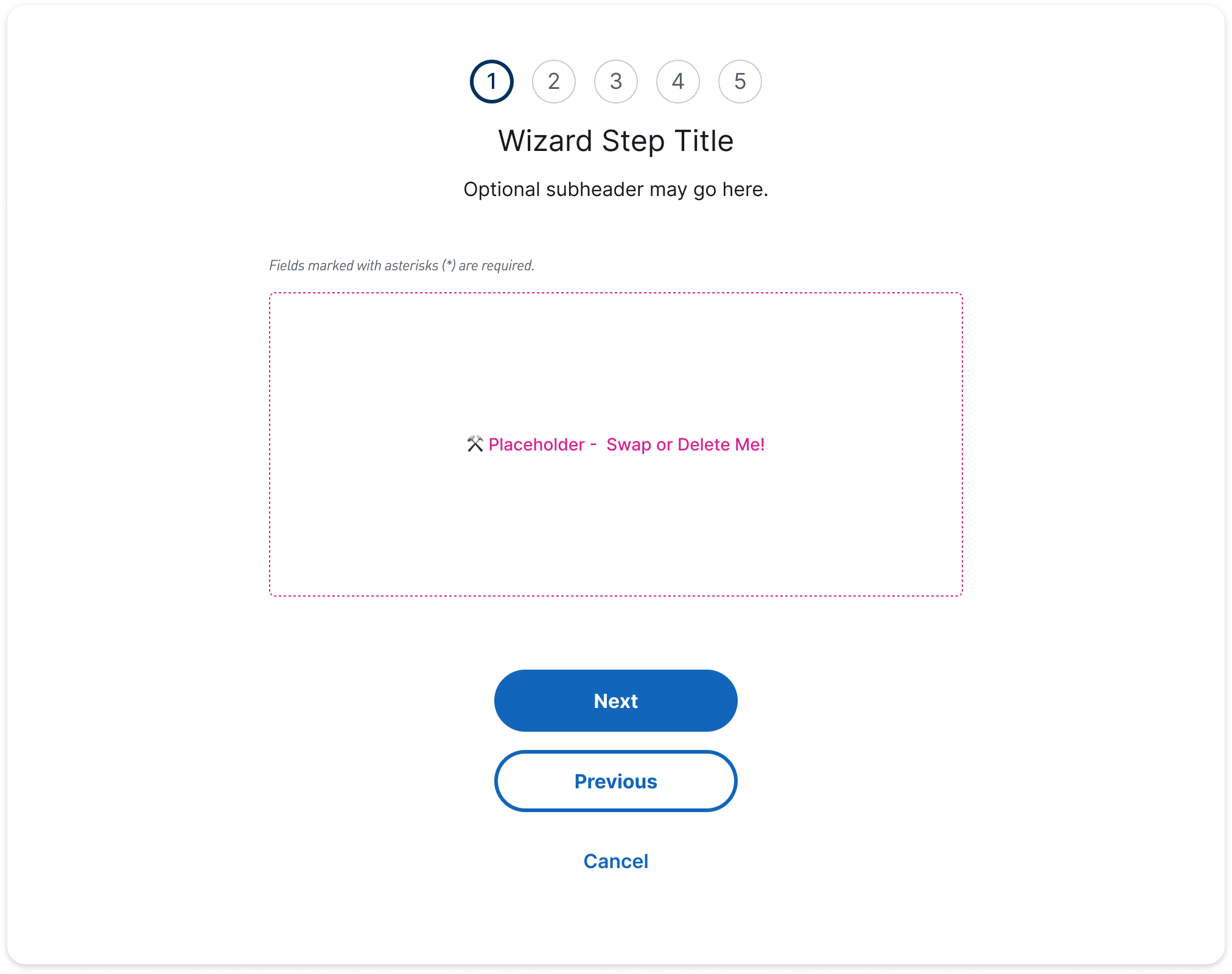

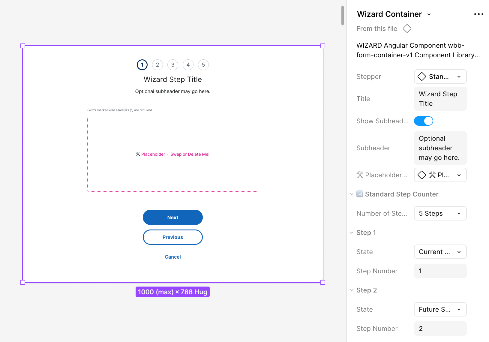
The Wizard (multistep form) container is an example of a complex component that is a building block for the Wizard Page Template.
Complex Components
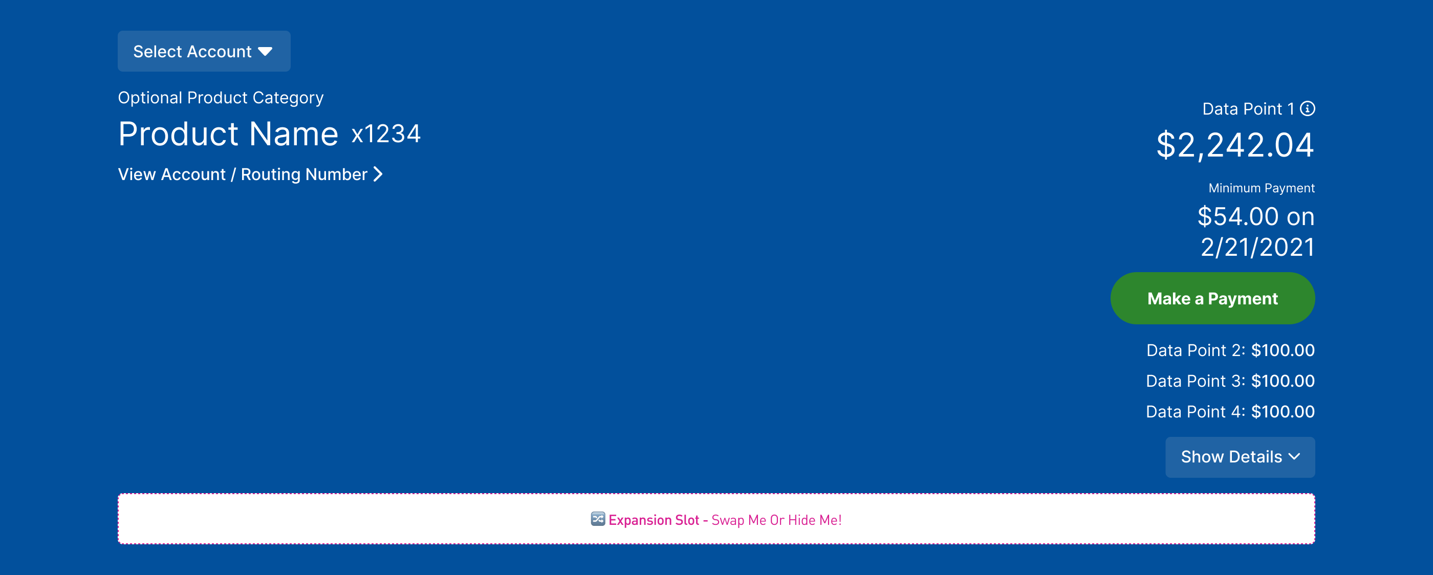
Complex components are made up of building blocks or nested base components. The most complicated of the complex components is the account mega, which contains nested building blocks with variants and slots to support a wide range of use cases.
Select Account
Optional Product Category
Product Name
x1234
View Account / Routing Number
Data Point 1
$2,242.04
Minimum Payment
$54.00 on 2/21/2021
Make a Payment
Data Point 2:
$100.00
Data Point 3:
$100.00
Data Point 4:
$100.00
Show Details
🔀 Expansion Slot - Swap Me or hide me!

9:41
More
Button
Cards
Rewards
Paze℠
Card Free ATM Access
Statements & Documents
9:41
Hello, Name
Reminders
3
We’re Enhancing Your Security
You might be asked to authenticate at sign on with a one-time passcode. Learn More
Mobile Titlebar building blocks and Page Titlebar variants
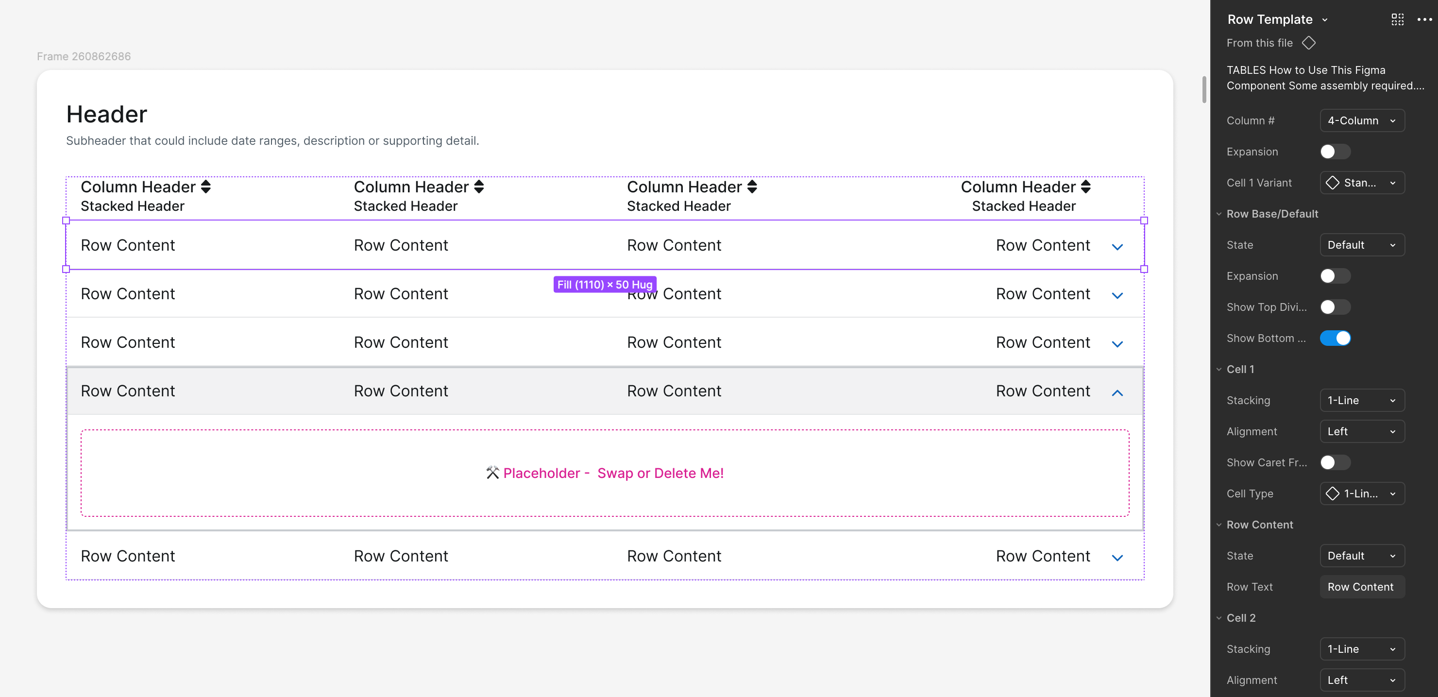
Wealth system table rows with nested table cell components
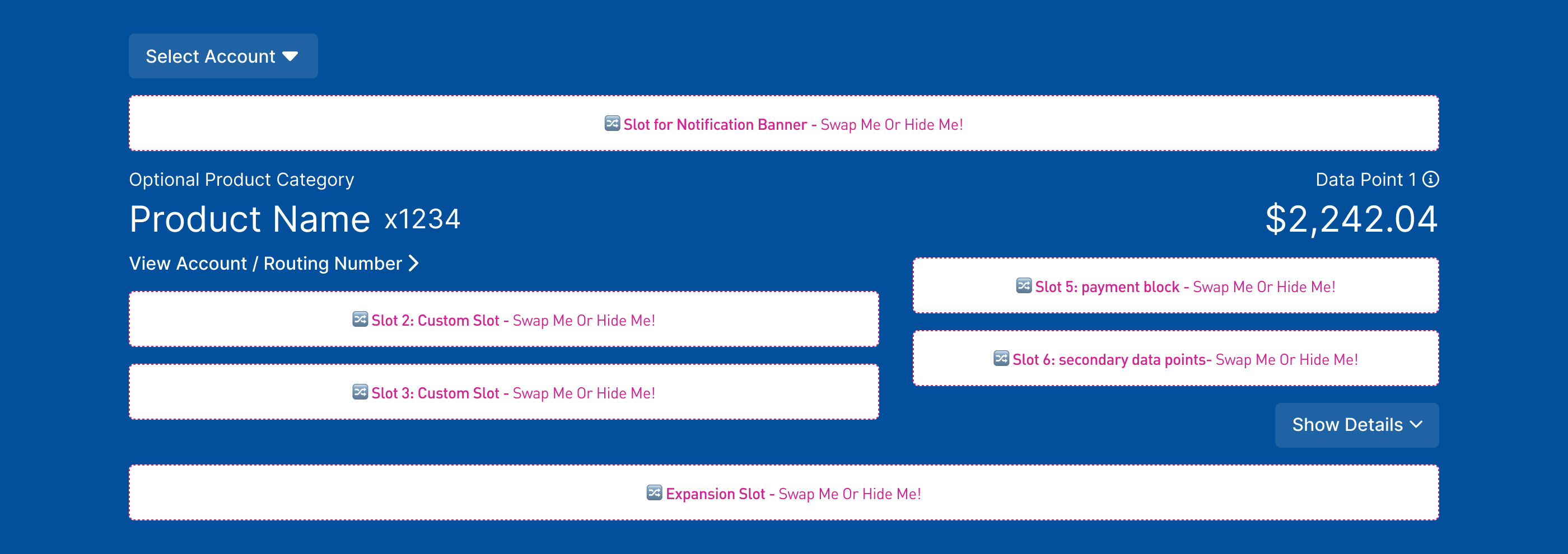
Components with Placeholders and Slots
Select Account
🔀 Slot: Notification- Swap Me or hide me!
Optional Product Category
Product Name
x1234
View Account / Routing Number
🔀 Slot 2: Custom - Swap Me or hide me!
🔀 Slot 3: Custom - Swap Me or hide me!
Data Point 1
$2,242.04
🔀 Slot 5: payment block - Swap or hide
🔀 Slot 6: secondary data point- Swap/hide
Show Details
🔀 Expansion Slot - Swap Me or hide me!
I created components with placeholders and slots to address common issues we encountered in Sketch:
01.
Layout and spacing mistakes
Designers often struggled with padding and spacing in complex layouts such as containers and multi-step wizard forms.
👉 Solution: Nested placeholder components that let designers add their content without needing to adjust spacing manually.
02.
Broken symbols and inconsistent development handoff
In Sketch, designers would break symbols without notifying the design system team, leading to outdated components being handed off, causing tech debt when development was overriding components to match old styles.
👉 Solution: Components with placeholders are built with building blocks and nested base components. This allows designers to detach if needed while still maintaining correct padding and staying linked to the library updates, ensuring that the Figma component matches the coded component, reducing the likelihood of overrides.
Page and Table Templates
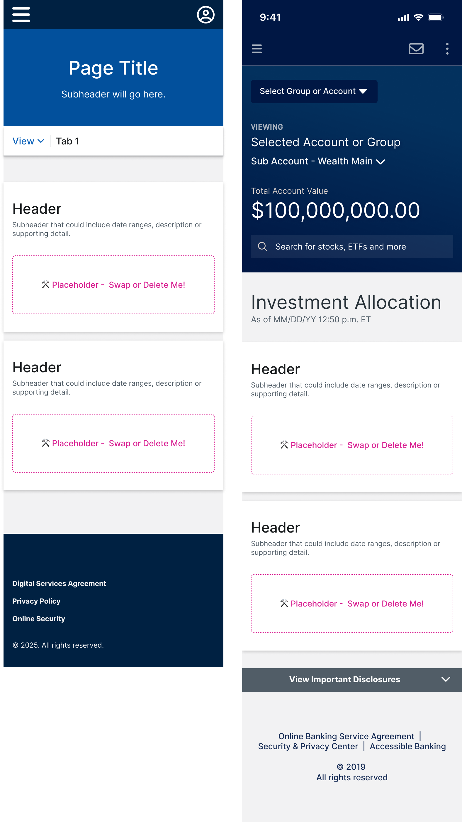
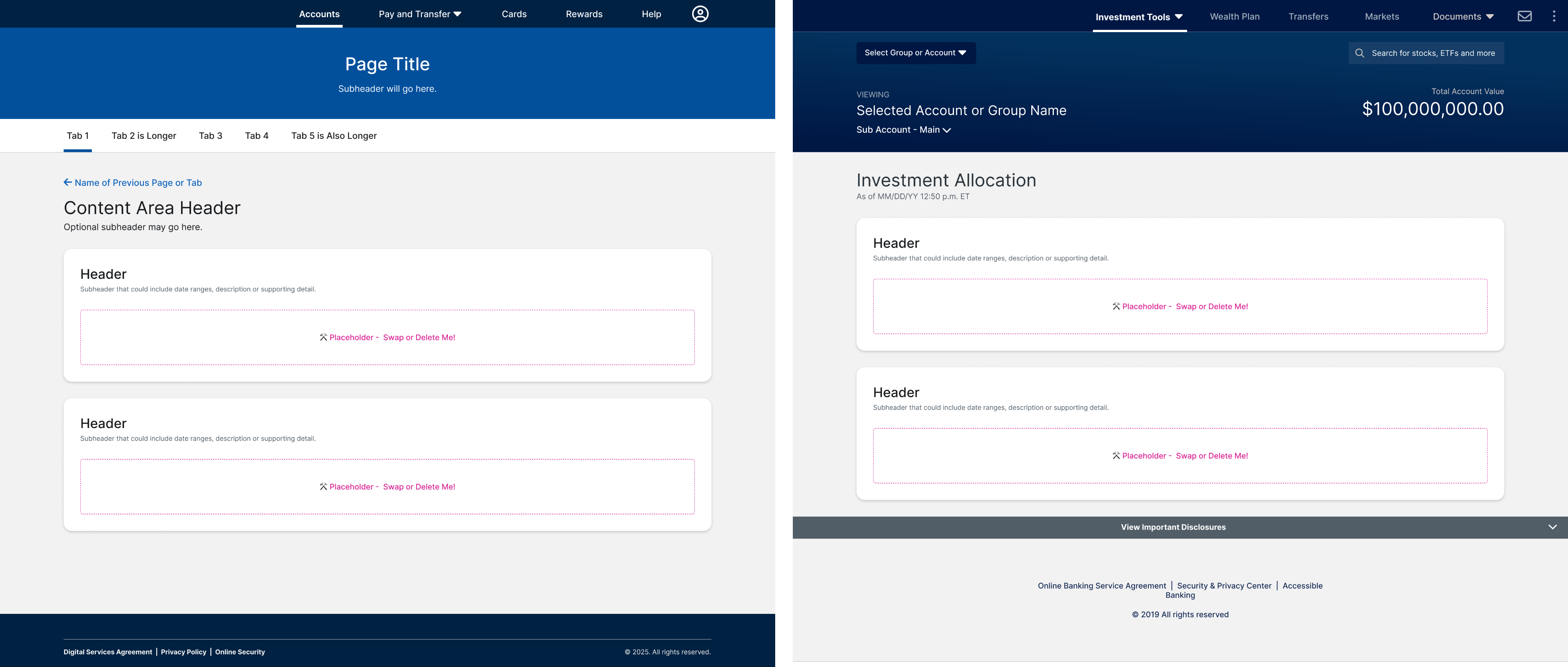
An example of standard page templates for the Retail system (left) and Wealth (right).
I built page templates for standard page layouts, forms, and table templates. The templates were built to be broken, so that designers wouldn’t have to worry about spacing, typography, and colors for the most common patterns and instead can focus on designing great experiences.
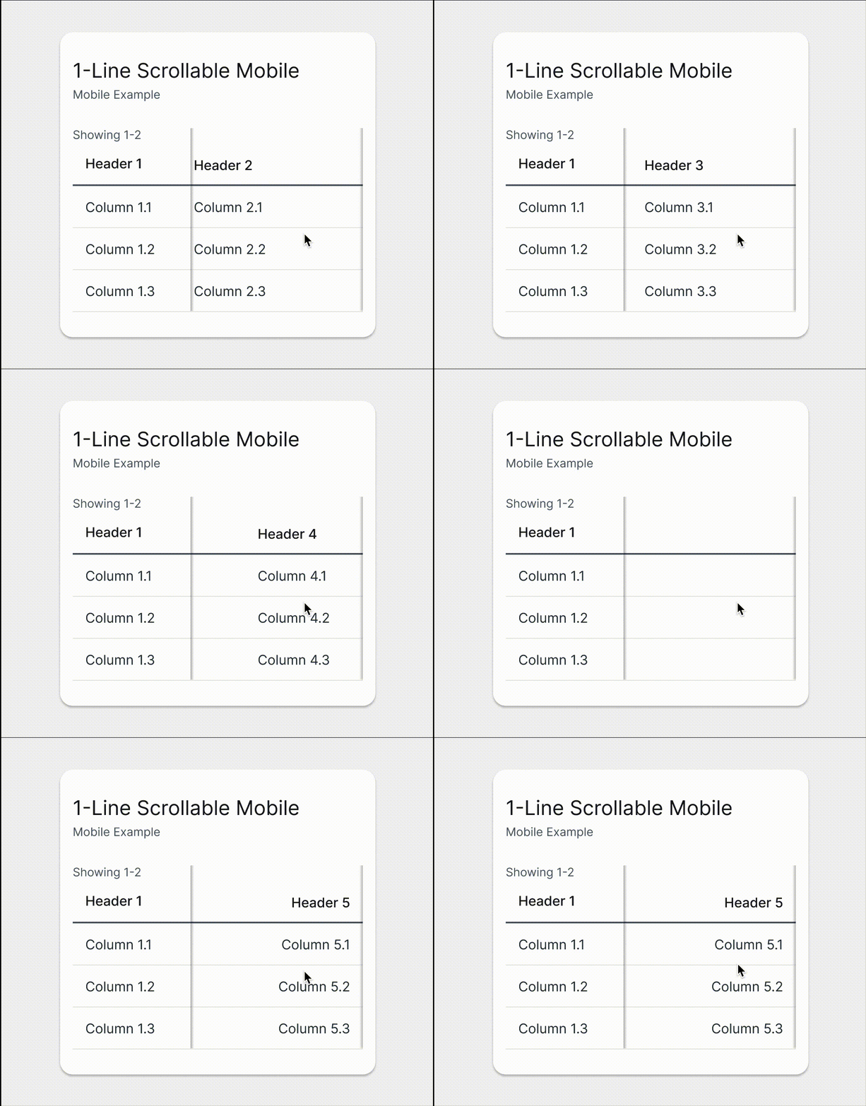
Wealth scrollable table template example
Component Notes
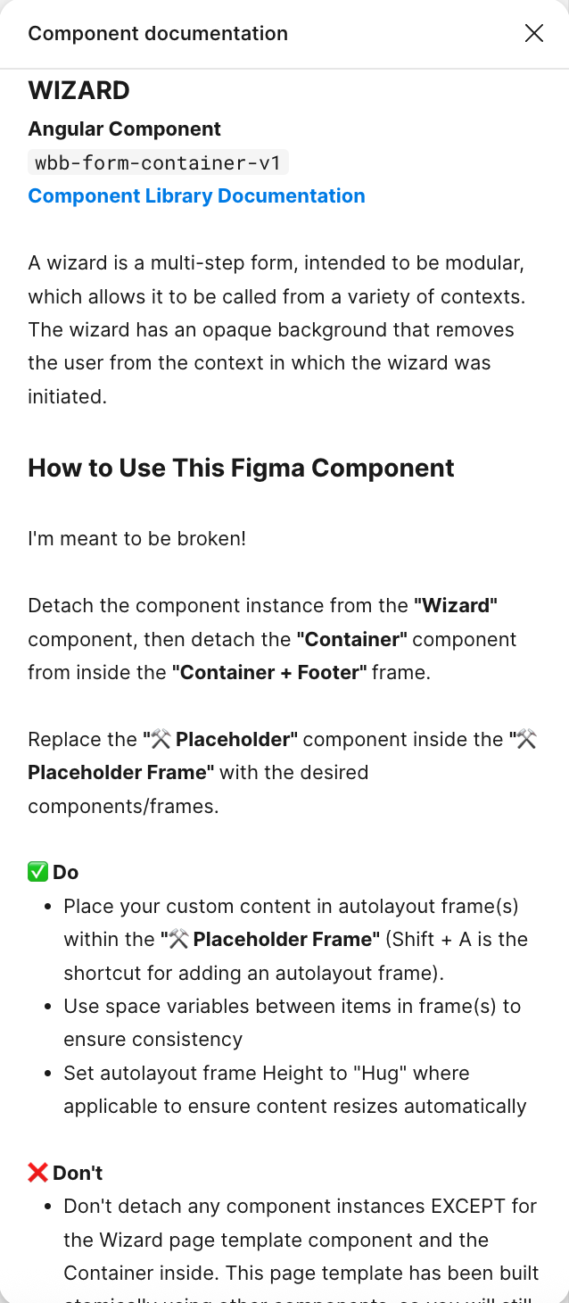
As a design systems team, we worked together to create a repeatable notes template that could be used for all Figma components. I took the opportunity to add guidelines to help designers learn how to use the Figma components, especially for new concepts they would need to learn in Figma, such as components with slots.
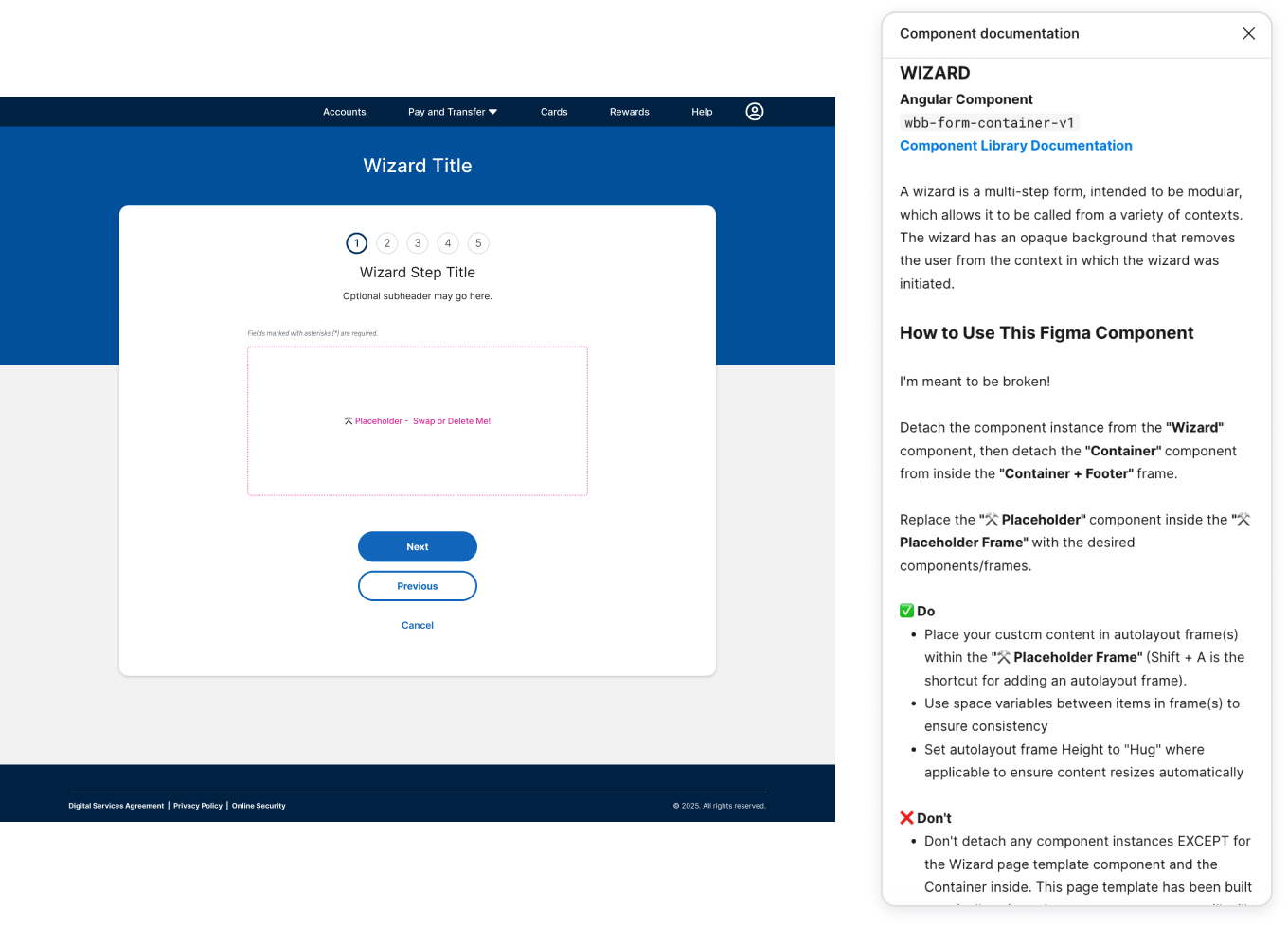
Component note anatomy
2
1
3
4
1
Design component name as it appears in the design system documentation
2
Angular component name, if applicable. This helps developers know when to use a component vs custom code.
3
Brief component description
4
Usage guidelines. This is where I included notes specific to that component or Figma tips, such as using auto layout or instance swap properites.
Component Testing and Adjustments
The timeline to Figma ended up getting pushed back almost 8 weeks, which gave me and my team time to create a quality control testing process. While 2 of my teammates with Figma access tested the components, I worked on building page templates.

Component Testing Plan
1
Set up a dedicated testing page in the library files and Excel sheet listing out all components
2
Two designers with CGI Figma access divide and conquer to test all components
3
Test each component against the design systems following the testing checklist, where applicable
4
Record test results in the spreadsheet. If a bug is found, assign a severity level and add a description of the issue
We set up an Excel file to compile feedback, where issues were classified according to the severity scale we defined so I knew which component fixes to prioritize.
Severity Scale
Definition
Low/None
Minor adjustments needed, such as color role missing or incorrect spacing, or enhancement opportunities identified. Will not impact designers and can be released and fixed later if needed.
Medium
Some bugs identified, such as missing component properties or auto layout issues that could be manually fixed by designers, but are inconvenient.
High
Many bugs identified, such as missing variants, problems with component properties or responsive behavior that cannot be resolved at the instance level. Need to be fixed prior to release.
Testing Results
Thanks to great teamwork and coordination, I was able to resolve all logged issues just in time for the file migration to the client’s new Figma account.
77%
Low Severity or No Issues
252 Component Categories
13%
Medium Severity
10%
High Severity
Issue Breakdown by System
Severity Level
Low/None
Medium
High
Total Categories
Retail
68
9
7
84
Low/None
Medium
High
Total Categories
Wealth
75
13
16
94
Low/None
Medium
High
Total Categories
Mobile
61
10
3
74
Lessons Learned and Reflections
Some components could have been built more intuitively
Some of the first components I built I attempted match closely to how they were built in Sketch, before I really had a grasp of the tool.
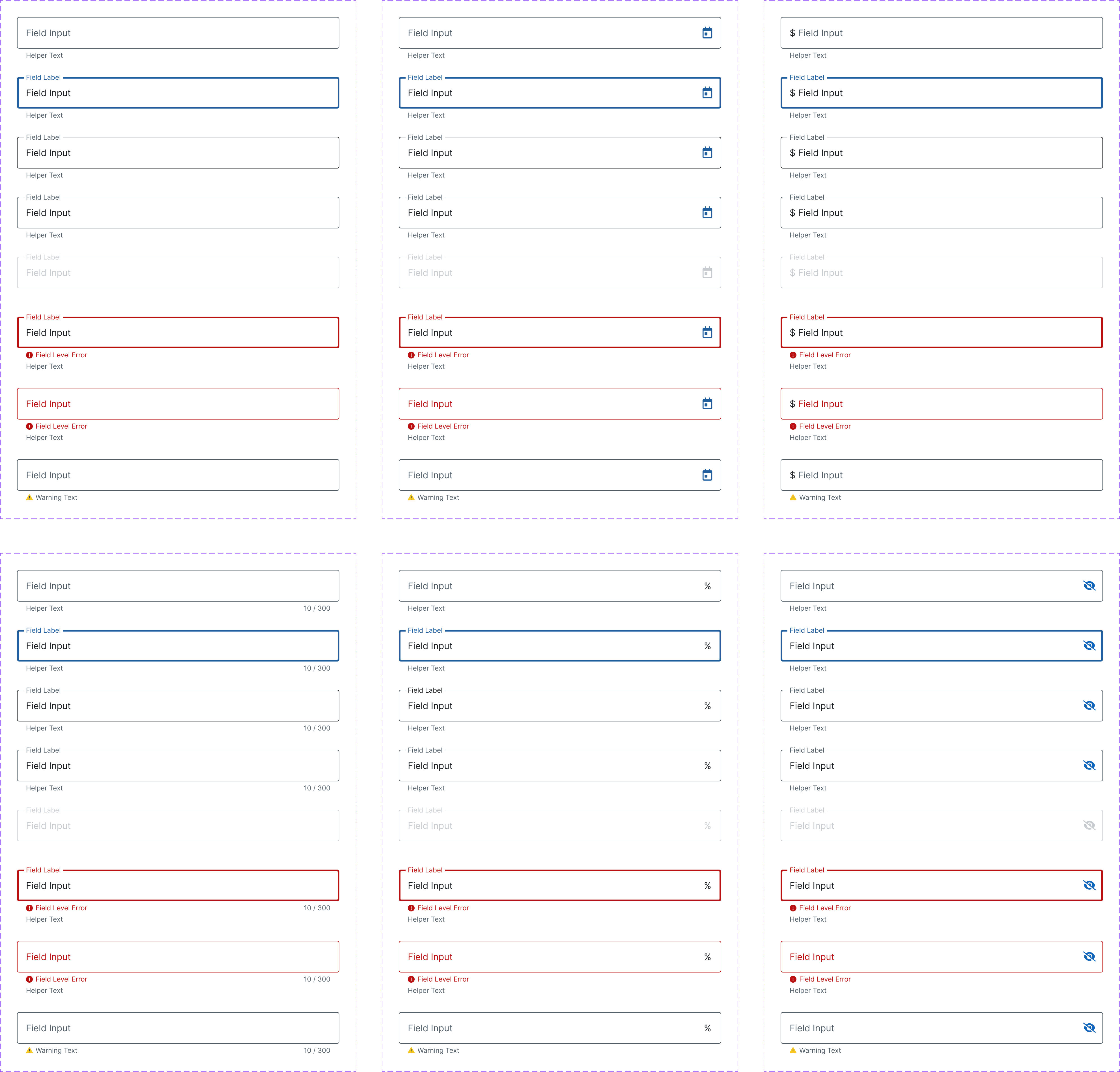
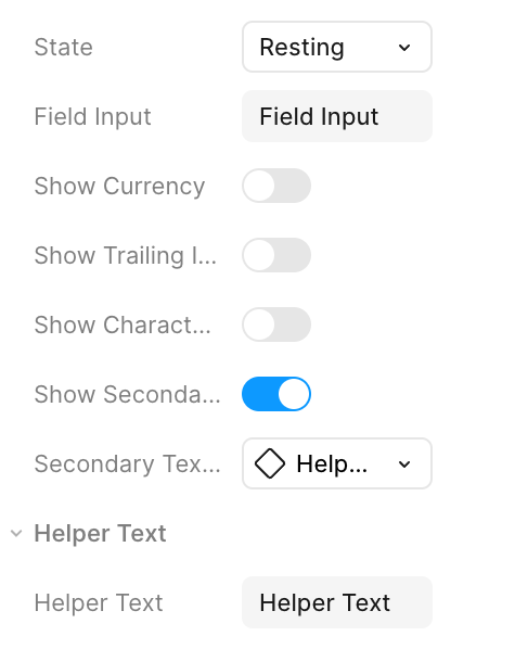
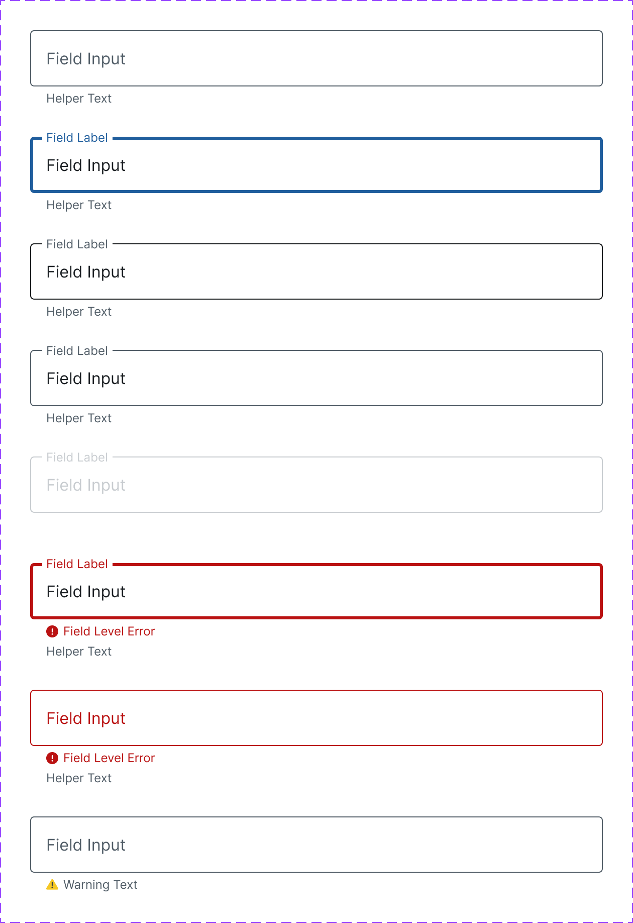
For example, I built each input type as a component with its own variants, which makes it difficult to manage from a design system level and more work for our users to find the component they need.
👎 How I built the text input components
👍 I would have built them as one component had I known better
Designers shouldn’t be encouraged to break components
One of the biggest mistakes I made was calling out which components designers could break. I had approached this from the mindset that they would still be linked to the library, and therefore it wasn’t a problem. Moving forward I would instead steer them to build local components to get the most out of slots, or encourage using the building blocks to build pages manually.
It’s not just about rebuilding the components in Figma - it’s also a mentality shift towards improved ways of working and collaboration


Company
CGI
|
Client
Top 10 US Bank
|
Some details under NDA
How I rebuilt 2,200+ Sketch symbols as Figma components
Late in the retail banking modernization project, the client switched design tools from Sketch to Figma and relied on me to rebuild 3 design systems in less than 5 months. Thousands of work hours and millions of dollars were at stake if I failed.
Overview
Team
3 Leadership Stakeholders
3 Retail UX Designers
2 Wealth UX Designers
2 Mobile UX Designers
⭐️ Me (Retail UX Designer)
My Role
Senior Product Designer
Design Systems
Timeline
5 Months
Project Overview

In early 2024, right in the middle of a mobile app redesign and just a few months away from launching retail web banking to customers, the bank decided to switch from Sketch to Figma. The timing was tricky.
The Big Problem
Teams still had to meet tight deadlines, and would also have to wait for the design system libraries to be published, further delaying the migration to Figma.
As a contractor, I was able to access Figma with my company account and so was tasked with rebuilding the bank’s 3 core design systems ahead of time:
Retail
Supports the online banking experience 12M+ customers with net worth under $1M
Wealth
Retail’s sister design system supporting wealthy clients with high net worth
Mobile App
App supporting both Retail and Wealth customers
More Problems
Delivering the 3 libraries on time was key to keeping 2 major releases on track, avoiding delays that could have cost the business significantly. In addition, I continued maintaining and supporting the Retail design system and its user base of 25+ product teams.
I also had to learn Figma.
Results and Impact
100% of components for all 3 systems were rebuilt, tested, and delivered on time
Key Metrics
1,000+
Total Figma components and page templates across 3 design systems
50%
Reduction in the number of Sketch symbols
28,800+
Estimated work hours saved by rebuilding the libraries ahead of time
🚀 Post-Launch
Because I built the design systems ahead of time, design teams were able to use the new components the first day the bank gained access.
The Figma components are used by:
3
Design Systems
30+
Product teams
70+
Designers
200+
Developers
I led Figma training and mentored design teams across web and mobile platforms
Design system teams
- Scheduled file handoff meeting with Wealth and Mobile designers to train them on their new libraries
- Set up weekly check-ins for 6 weeks with the Wealth team
- Made time in my schedule for ad-hoc meetings if they felt stuck
- Gave 2+ component demos at Wealth and Mobile office hours to help support their users and answer library specific questions
Product teams
- Gave at least 6+ Figma demos at the Retail weekly office hours attended by up to 60+ designers and developers
- Helped establish a dedicated Figma support help desk Teams channel to better track questions and feedback
- Weekly support meeting with a design pod of 4-6 designers
- 1:1 meetings with designers as needed
Testimonial
Amelie H.
Product Designer
As a product designer using the system, Susan was an ideal teammate. Beyond informative practice-wide weekly sessions, she took the time to meet with our smaller design pod at another time each week.
Early in the process, we often rolled through long lists of edits and requests, and she took every one of our comments and questions and worked to improve the design system. Nothing was too small or too big for her to be concerned about.
Read Full Review
Improved construction of the Figma components nearly eliminated common spacing issues we would see in design reviews with Sketch
For example, I built page templates, such as multi-step wizard forms, to include common design patterns that were missing from Sketch.
On the Retail design system team, we saw nearly an 80% reduction in the number of spacing issues we identified during design reviews when designers used the page templates, compared to what we saw with Sketch.

Before

- Multi-step wizard form templates didn’t include examples of common form patterns such as the title/step counter and button stack
- Spacing needed to be set manually, which led to inconsistency in code
- Top navigation tabs were selected by default, contradicting design standards that forms do not show selected tabs, requiring manual work to remove
After

- Common form patterns are baked into the wizard templates and include variants to support a wide range of use cases
- Max width is defined at the container component level ensuring when the placeholder is swapped, content stays the correct width
- Navigation is built with the tabs off by default to match standards and prevent unnecessary manual work
Because of my success delivering 3 design systems on time, I was asked to build 2 additional design systems a few months later
Legacy Mobile App Library
150+ Components
Responsive Web View Themed Library
40+ Components
Although the legacy mobile app library was originally descoped from the Figma migration, it suddenly became a priority months later when new features needed to be added. A few months later, the responsive web view library, also previously descoped, was needed in a few weeks. I rebuilt both libraries each under a month, all while continuing my regular work on the Retail design system.
Ultimately, the design systems support the modernization of the digital banking experience, which will reach 12 million customers across the US after the final customer launch wave is completed, estimated fall 2025.
Nearly a year later, the components have more than
2.2 Million
inserts combined across the 3 Figma libraries
Less than
1%
were detached
Process
May 2024
Project Kickoff and Audit
- Define scope with stakeholders
- Initial timeline 8 weeks
- I audited the Sketch libraries then created a weekly roadmap
Week 1-15: Figma Conversion
- Started with foundations, then progressed from simple to complex components
- Biweekly progress review meetings with systems designers
- Finalized design tokens
Testing and File Handoff
- Figma component QA testing
- Transferred library files to client’s Figma
- I provided support and training to the design systems teams
Actual Deadline
Late October 2024
Figma Access
Nov 2024
Initial Deadline
August 2024
Scroll to view full timeline
Project Kick-Off
To kick off the project, I met with 3 members of design leadership and representatives from each design system to prioritize the components and determine the timeline. The initial scope was one 2 week sprint to audit the Sketch libraries and 8 weeks to rebuild all 3 systems.
Leadership and Design System Reps
Challenges
Getting stakeholder buy-in for rebuilding the components differently in Figma
Stakeholders were concerned that the new approach to building components would be too difficult for designers to learn while they were juggling file rebuilds and new projects.
To ease their worries, I set up regular meetings with leadership to show them how Figma's features like auto layout made component building more intuitive and efficient, ultimately saving design time.
Due to working in siloed teams, I lacked visibility into the other 2 systems
The symbol audit was the first time I had opened the Wealth and Mobile files. There were some points of confusion such as unorganized symbols, and confusing color style naming.
To ensure the new components matched expectations, I established biweekly check-ins with the Wealth and Mobile teams. I reviewed my open questions and made recommendations for improving their components while taking their feedback and needs into consideration.
The Wealth system had not finalized their new colors
Wealth had decided to align to the new color system several months after Retail and Mobile finalized the new color ramps, which was shortly before the Figma rebuild project started. By the time I started rebuilding the libraries, Wealth had not fully set up their color design token structure.
This was a huge blocker for me to set up their Figma color variables, which I needed to get in place prior to building their components.
To make things more complicated, their existing system had several instances of one-off color styles and floating HEX values, with some cases of inconsistent color usage across similar symbols.
I solved these issues by:
- Looking at their system holistically to identify similar colors and opportunities for consolidation
- Mapping their brand-specific colors to our new color token pairing system based on Material’s color roles, improving organization
- Presenting the updates to the Wealth team for feedback during our check-ins to ensure we were on the same page, iterating as needed

Example of how I consolidated similar existing Wealth colors to the new color ramp system and as a single design token.
Sketch Library Audit
I catalogued all symbol categories in a spreadsheet to quantify what would need to be delivered.
Due to the short timeline, I advised stakeholders to remove page templates from scope, since they could be assembled from existing components. This minimized risk, ensuring design work could continue even if templates were delayed - unlike core components, where delays could impact entire project deadlines.
Excluding colors and type styles...
There were almost 2,300 Sketch symbols 😱
I estimated that I could reduce this by at least 30% in Figma.

I created a checklist template to track weekly progress for each design system

Retail
Wealth
Mobile
I listed out the component categories by system, then tagged them by week, starting with foundations, then working from simple to complex components.
I rebuilt the 3 systems at the same time because it was easier to track. Additionally, the Wealth design system shared approximately 70% of components with Retail. I set up their foundations, then decided to wait until Retail was mostly built out and clone the library to save time.
Week 1
Retail Web
Naming convention and folder structure
Set up foundations
- Color roles
- Typography
- Grid styles
- Icons
- Spacing
- Elevation
- Illustrations
Buttons
Wealth
Naming convention and folder structure
Set up foundations
- Color roles
- Typography
- Grid styles
- Icons
- Spacing
- Elevation
- Illustrations
Wealth shares many common components with Retail Web and will be built as a clone of that file when progress has been made
Mobile
Naming convention and folder structure
Set up foundations
- Color roles
- Typography
- Grid styles
- Icons
- Spacing
- Elevation
- Illustrations
Buttons
Card Art
Example checklist for the first week

The Components
Global Color System
Before starting design system work, I set up the color library with our new global (or primitives) color system, which would be aliased by all 3 systems as color roles.
100
98
95
90
80
70
60
50
40
30
20
10
0
Prior to the Figma rebuild, I led the effort to create a shared color ramp library and align the 3 design systems to one scalable color system (case study coming soon).
Foundations
Next, I continued with local foundational tokens - color role variables, typography, grids, and other styles, integrating the new design token naming conventions for Retail and Wealth (Mobile had their own token system established prior to our token working sessions. We were able to align color role naming for the 3 systems but are otherwise not aligned in foundational tokens).
Color Role
$primary
$on-primary
$on-surface
$on-surface-variant-low
$outline
$confirmation
$attention
$error
Retail Value
blue40
neutral100
neutral10
neutral40
neutral90
green50
yellow80
red40
Mobile Value
blue40
neutral100
neutral10
neutral40
neutral95
green50
yellow80
red40
Wealth Value
azurite20
neutral100
neutral10
neutral40
neutral90
green50
yellow80
red40
Some common color roles used across the 3 systems, based on Material 3’s naming convention. They are approx. 75% aligned on naming and colors used, but there are a handful of differences, including the primary color.
Mobile was the only one of the systems that needed to support theming - light and dark mode for 2 different brands - Retail and Wealth.

Because mobile was undergoing a redesign, they already had a token structure in place in their code. Due to tech constraints at the time, Retail Web and Wealth were not ready to fully implement design tokens except colors, so their spacing tokens in Figma were limited to primitives (the base level of design tokens that reference a raw value).
Retail
Wealth
Name
space-050
space-100
space-150
space-200
space-300
Value
5 px
10 px
15 px
20 px
30 px
Mobile
Name
padding-xs
padding-small
padding-medium
margin-large
gutter-small
Value
4 px
6 px
8 px
16 px
20 px
Base Components
Like Building Blocks, these components are made up of combinations of design tokens. They may also include some nested building block elements (such as error text in a text input). I built in basic prototyping functionality (such as hover and selected states) where applicable.
Jumbo
$on-primary
$primary
headline-large
Jumbo
padding-medium
padding-xxl
Building Blocks
Building block components are made up of various design tokens (Figma variables) or nested base components. Some building blocks are also complex components with other nested components that are in turn nested within page templates.

Retail global navigation component is made up of building blocks for icons and menu items.
Building blocks allow flexibility in the system when designers are trying something new.
They are also important for supporting breakable complex components and page templates to ensure designers are still linked to the library.


The Wizard (multistep form) container is an example of a complex component that is a building block for the Wizard Page Template.
Complex Components
Complex components are made up of building blocks or nested base components. The most complicated of the complex components is the account mega, which contains nested building blocks with variants and slots to support a wide range of use cases.
9:41
More
Button
Cards
Rewards
Paze℠
Card Free ATM Access
Statements & Documents
9:41
Hello, Name
Reminders
3
We’re Enhancing Your Security
You might be asked to authenticate at sign on with a one-time passcode. Learn More
Mobile Titlebar building blocks and Page Titlebar variants

Wealth system table rows with nested table cell components
Components with Placeholders and Slots
I created components with placeholders and slots to address common issues we encountered in Sketch:
01.
Layout and spacing mistakes
Designers often struggled with padding and spacing in complex layouts such as containers and multi-step wizard forms.
👉 Solution: Nested placeholder components that let designers add their content without needing to adjust spacing manually.
02.
Broken symbols and inconsistent development handoff
In Sketch, designers would break symbols without notifying the design system team, leading to outdated components being handed off, causing tech debt when development was overriding components to match old styles.
👉 Solution: Components with placeholders are built with building blocks and nested base components. This allows designers to detach if needed while still maintaining correct padding and staying linked to the library updates, ensuring that the Figma component matches the coded component, reducing the likelihood of overrides.
Page and Table Templates
An example of standard page templates for the Retail system (left) and Wealth (right).
I built page templates for standard page layouts, forms, and table templates. The templates were built to be broken, so that designers wouldn’t have to worry about spacing, typography, and colors for the most common patterns and instead can focus on designing great experiences.

Wealth scrollable table template example
Component Notes
As a design systems team, we worked together to create a repeatable notes template that could be used for all Figma components. I took the opportunity to add guidelines to help designers learn how to use the Figma components, especially for new concepts they would need to learn in Figma, such as components with slots.


2
1
3
4
1
Design component name as it appears in the design system documentation
2
Angular component name, if applicable. This helps developers know when to use a component vs custom code.
3
Brief component description
4
Usage guidelines. This is where I included notes specific to that component or Figma tips, such as using auto layout or instance swap properites.
Component note anatomy
Component Testing and Adjustments
The timeline to Figma ended up getting pushed back almost 8 weeks, which gave me and my team time to create a quality control testing process. While 2 of my teammates with Figma access tested the components, I worked on building page templates.

Component Testing Plan
1
Set up a dedicated testing page in the library files and Excel sheet listing out all components
2
Two designers with CGI Figma access divide and conquer to test all components
3
Test each component against the design systems following the testing checklist, where applicable
4
Record test results in the spreadsheet. If a bug is found, assign a severity level and add a description of the issue
We set up an Excel file to compile feedback, where issues were classified according to the severity scale we defined so I knew which component fixes to prioritize.
Severity Scale
Low/None
Medium
High
Definition
Minor adjustments needed, such as color role missing or incorrect spacing, or enhancement opportunities identified. Will not impact designers and can be released and fixed later if needed.
Some bugs identified, such as missing component properties or auto layout issues that could be manually fixed by designers, but are inconvenient.
Many bugs identified, such as missing variants, problems with component properties or responsive behavior that cannot be resolved at the instance level. Need to be fixed prior to release.
Testing Results
Thanks to great teamwork and coordination, I was able to resolve all logged issues just in time for the file migration to the client’s new Figma account.
13%
Medium Severity
77%
Low Severity or No Issues
10%
High Severity
252 Component Categories
Issue Breakdown by System
Severity Level
Low/None
Medium
High
Total Categories
Retail
68
9
7
84
Wealth
75
13
16
94
Mobile
61
10
3
74
Lessons Learned and Reflections
Some components could have been built more intuitively
Some of the first components I built I attempted match closely to how they were built in Sketch, before I really had a grasp of the tool.
For example, I built each input type as a component with its own variants, which makes it difficult to manage from a design system level and more work for our users to find the component they need.
👎 How I built the text input components

👍 I would have built them as one component had I known better


Designers shouldn’t be encouraged to break components
One of the biggest mistakes I made was calling out which components designers could break. I had approached this from the mindset that they would still be linked to the library, and therefore it wasn’t a problem. Moving forward I would instead steer them to build local components to get the most out of slots, or encourage using the building blocks to build pages manually.
It’s not just about rebuilding the components in Figma - it’s also a mentality shift towards improved ways of working and collaboration


Company
CGI
|
Client
Top 10 US Bank
|
Some details under NDA
How I rebuilt 2,200+ Sketch symbols as Figma components
Late in the retail banking modernization project, the client switched design tools from Sketch to Figma and relied on me to rebuild 3 design systems in less than 5 months. Thousands of work hours and millions of dollars were at stake if I failed.
Overview
Team
3 Leadership Stakeholders
3 Retail UX Designers
2 Wealth UX Designers
2 Mobile UX Designers
⭐️ Me (Retail UX Designer)
My Role
Senior Product Designer
Design Systems
Timeline
5 Months
Project Overview

In early 2024, right in the middle of a mobile app redesign and just a few months away from launching retail web banking to customers, the bank decided to switch from Sketch to Figma. The timing was tricky.
The Big Problem
Teams still had to meet tight deadlines, and would also have to wait for the design system libraries to be published, further delaying the migration to Figma.
As a contractor, I was able to access Figma with my company account and so was tasked with rebuilding the bank’s 3 core design systems ahead of time:
Retail
Supports the online banking experience 12M+ customers with net worth under $1M
Wealth
Retail’s sister design system supporting wealthy clients with high net worth
Mobile App
App supporting both Retail and Wealth customers
More Problems
Delivering the 3 libraries on time was key to keeping 2 major releases on track, avoiding delays that could have cost the business significantly. In addition, I continued maintaining and supporting the Retail design system and its user base of 25+ product teams.
I also had to learn Figma.
Results and Impact
100% of components for all 3 systems were rebuilt, tested, and delivered on time
Key Metrics
1,000+
Total Figma components and page templates across 3 design systems
50%
Reduction in the number of Sketch symbols
28,800+
Estimated work hours saved by rebuilding the libraries ahead of time
🚀 Post-Launch
Because I built the design systems ahead of time, design teams were able to use the new components the first day the bank gained access.
The Figma components are used by:
3
Design Systems
30+
Product teams
70+
Designers
200+
Developers
I led Figma training and mentored design teams across web and mobile platforms
Design system teams
- Scheduled file handoff meeting with Wealth and Mobile designers to train them on their new libraries
- Set up weekly check-ins for 6 weeks with the Wealth team
- Made time in my schedule for ad-hoc meetings if they felt stuck
- Gave 2+ component demos at Wealth and Mobile office hours to help support their users and answer library specific questions
Product teams
- Gave at least 6+ Figma demos at the Retail weekly office hours attended by up to 60+ designers and developers
- Helped establish a dedicated Figma support help desk Teams channel to better track questions and feedback
- Weekly support meeting with a design pod of 4-6 designers
- 1:1 meetings with designers as needed
Testimonial
Amelie H.
Product Designer
As a product designer using the system, Susan was an ideal teammate. Beyond informative practice-wide weekly sessions, she took the time to meet with our smaller design pod at another time each week.
Early in the process, we often rolled through long lists of edits and requests, and she took every one of our comments and questions and worked to improve the design system. Nothing was too small or too big for her to be concerned about.
Read Full Review
Improved construction of the Figma components nearly eliminated common spacing issues we would see in design reviews with Sketch
For example, I built page templates, such as multi-step wizard forms, to include common design patterns that were missing from Sketch.
On the Retail design system team, we saw nearly an 80% reduction in the number of spacing issues we identified during design reviews when designers used the page templates, compared to what we saw with Sketch.

Before

- Multi-step wizard form templates didn’t include examples of common form patterns such as the title/step counter and button stack
- Spacing needed to be set manually, which led to inconsistency in code
- Top navigation tabs were selected by default, contradicting design standards that forms do not show selected tabs, requiring manual work to remove
After

- Common form patterns are baked into the wizard templates and include variants to support a wide range of use cases
- Max width is defined at the container component level ensuring when the placeholder is swapped, content stays the correct width
- Navigation is built with the tabs off by default to match standards and prevent unnecessary manual work
Because of my success delivering 3 design systems on time, I was asked to build 2 additional design systems a few months later
Legacy Mobile App Library
150+ Components
Responsive Web View Themed Library
40+ Components
Although the legacy mobile app library was originally descoped from the Figma migration, it suddenly became a priority months later when new features needed to be added. A few months later, the responsive web view library, also previously descoped, was needed in a few weeks. I rebuilt both libraries each under a month, all while continuing my regular work on the Retail design system.
Ultimately, the design systems support the modernization of the digital banking experience, which will reach 12 million customers across the US after the final customer launch wave is completed, estimated fall 2025.
Nearly a year later, the components have more than
2.2 Million
inserts combined across the 3 Figma libraries
Less than
1%
were detached
Process
May 2024
Project Kickoff and Audit
- Define scope with stakeholders
- Initial timeline 8 weeks
- I audited the Sketch libraries then created a weekly roadmap
Week 1-15: Figma Conversion
- Started with foundations, then progressed from simple to complex components
- Biweekly progress review meetings with systems designers
- Finalized design tokens
Testing and File Handoff
- Figma component QA testing
- Transferred library files to client’s Figma
- I provided support and training to the design systems teams
Actual Deadline
Late October 2024
Figma Access
Nov 2024
Initial Deadline
August 2024
Project Kick-Off
To kick off the project, I met with 3 members of design leadership and representatives from each design system to prioritize the components and determine the timeline. The initial scope was one 2 week sprint to audit the Sketch libraries and 8 weeks to rebuild all 3 systems.
Leadership and Design System Reps

Challenges
Getting stakeholder buy-in for rebuilding the components differently in Figma
Stakeholders were concerned that the new approach to building components would be too difficult for designers to learn while they were juggling file rebuilds and new projects.
To ease their worries, I set up regular meetings with leadership to show them how Figma's features like auto layout made component building more intuitive and efficient, ultimately saving design time.
Due to working in siloed teams, I lacked visibility into the other 2 systems
The symbol audit was the first time I had opened the Wealth and Mobile files. There were some points of confusion such as unorganized symbols, and confusing color style naming.
To ensure the new components matched expectations, I established biweekly check-ins with the Wealth and Mobile teams. I reviewed my open questions and made recommendations for improving their components while taking their feedback and needs into consideration.
The Wealth system had not finalized their new colors
Wealth had decided to align to the new color system several months after Retail and Mobile finalized the new color ramps, which was shortly before the Figma rebuild project started. By the time I started rebuilding the libraries, Wealth had not fully set up their color design token structure.
This was a huge blocker for me to set up their Figma color variables, which I needed to get in place prior to building their components.
To make things more complicated, their existing system had several instances of one-off color styles and floating HEX values, with some cases of inconsistent color usage across similar symbols.
I solved these issues by:
- Looking at their system holistically to identify similar colors and opportunities for consolidation
- Mapping their brand-specific colors to our new color token pairing system based on Material’s color roles, improving organization
- Presenting the updates to the Wealth team for feedback during our check-ins to ensure we were on the same page, iterating as needed

Example of how I consolidated similar existing Wealth colors to the new color ramp system and as a single design token.
Sketch Library Audit
I catalogued all symbol categories in a spreadsheet to quantify what would need to be delivered.
Due to the short timeline, I advised stakeholders to remove page templates from scope, since they could be assembled from existing components. This minimized risk, ensuring design work could continue even if templates were delayed - unlike core components, where delays could impact entire project deadlines.
Excluding colors and type styles...
There were almost 2,300 Sketch symbols 😱
I estimated that I could reduce this by at least 30% in Figma.

I created a checklist template to track weekly progress for each design system

Retail
Wealth
Mobile
I listed out the component categories by system, then tagged them by week, starting with foundations, then working from simple to complex components.
I rebuilt the 3 systems at the same time because it was easier to track. Additionally, the Wealth design system shared approximately 70% of components with Retail. I set up their foundations, then decided to wait until Retail was mostly built out and clone the library to save time.
Week 1
Retail Web
Naming convention and folder structure
Set up foundations
- Color roles
- Typography
- Grid styles
- Icons
- Spacing
- Elevation
- Illustrations
Buttons
Wealth
Naming convention and folder structure
Set up foundations
- Color roles
- Typography
- Grid styles
- Icons
- Spacing
- Elevation
- Illustrations
Wealth shares many common components with Retail Web and will be built as a clone of that file when progress has been made
Mobile
Naming convention and folder structure
Set up foundations
- Color roles
- Typography
- Grid styles
- Icons
- Spacing
- Elevation
- Illustrations
Buttons
Card Art
Example checklist for the first week

The Components
Global Color System
Before starting design system work, I set up the color library with our new global (or primitives) color system, which would be aliased by all 3 systems as color roles.
100
98
95
90
80
70
60
50
40
30
20
10
0
Prior to the Figma rebuild, I led the effort to create a shared color ramp library and align the 3 design systems to one scalable color system (case study coming soon).
Foundations
Next, I continued with local foundational tokens - color role variables, typography, grids, and other styles, integrating the new design token naming conventions for Retail and Wealth (Mobile had their own token system established prior to our token working sessions. We were able to align color role naming for the 3 systems but are otherwise not aligned in foundational tokens).
Color Role
$primary
$on-primary
$on-surface
$on-surface-variant-low
$outline
$confirmation
$attention
$error
Retail Value
blue40
neutral100
neutral10
neutral40
neutral90
green50
yellow80
red40
Mobile Value
blue40
neutral100
neutral10
neutral40
neutral95
green50
yellow80
red40
Wealth Value
azurite20
neutral100
neutral10
neutral40
neutral90
green50
yellow80
red40
Some common color roles used across the 3 systems, based on Material 3’s naming convention. They are approx. 75% aligned on naming and colors used, but there are a handful of differences, including the primary color.
Mobile was the only one of the systems that needed to support theming - light and dark mode for 2 different brands - Retail and Wealth.

Because mobile was undergoing a redesign, they already had a token structure in place in their code. Due to tech constraints at the time, Retail Web and Wealth were not ready to fully implement design tokens except colors, so their spacing tokens in Figma were limited to primitives (the base level of design tokens that reference a raw value).
Retail
Wealth
Name
space-050
space-100
space-150
space-200
space-300
Value
5 px
10 px
15 px
20 px
30 px
Mobile
Name
padding-xs
padding-small
padding-medium
margin-large
gutter-small
Value
4 px
6 px
8 px
16 px
20 px
Base Components
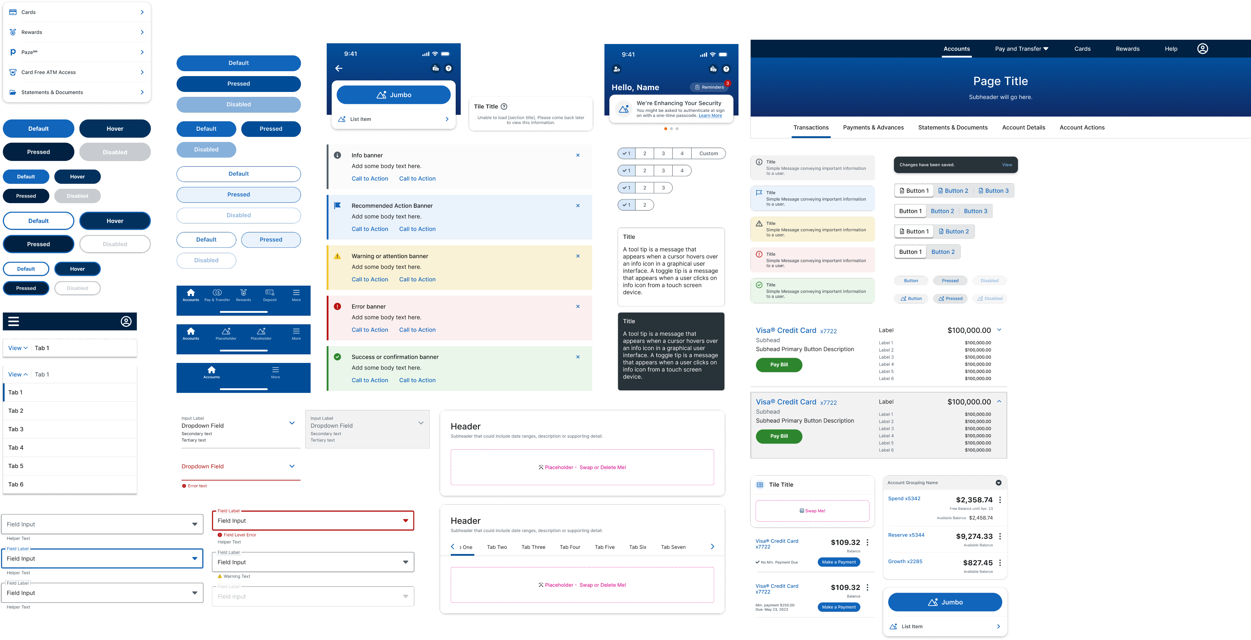
Like Building Blocks, these components are made up of combinations of design tokens. They may also include some nested building block elements (such as error text in a text input). I built in basic prototyping functionality (such as hover and selected states) where applicable.
Jumbo
$on-primary
$primary
headline-large
Jumbo
padding-medium
padding-xxl

Building Blocks
Building block components are made up of various design tokens (Figma variables) or nested base components. Some building blocks are also complex components with other nested components that are in turn nested within page templates.

Retail global navigation component is made up of building blocks for icons and menu items.
Building blocks allow flexibility in the system when designers are trying something new.
They are also important for supporting breakable complex components and page templates to ensure designers are still linked to the library.


The Wizard (multistep form) container is an example of a complex component that is a building block for the Wizard Page Template.
Complex Components
Complex components are made up of building blocks or nested base components. The most complicated of the complex components is the account mega, which contains nested building blocks with variants and slots to support a wide range of use cases.


9:41
More
Button
Cards
Rewards
Paze℠
Card Free ATM Access
Statements & Documents
9:41
Hello, Name
Reminders
3
We’re Enhancing Your Security
You might be asked to authenticate at sign on with a one-time passcode. Learn More
Mobile Titlebar building blocks and Page Titlebar variants

Wealth system table rows with nested table cell components
Components with Placeholders and Slots

I created components with placeholders and slots to address common issues we encountered in Sketch:
01.
Layout and spacing mistakes
Designers often struggled with padding and spacing in complex layouts such as containers and multi-step wizard forms.
👉 Solution: Nested placeholder components that let designers add their content without needing to adjust spacing manually.
02.
Broken symbols and inconsistent development handoff
In Sketch, designers would break symbols without notifying the design system team, leading to outdated components being handed off, causing tech debt when development was overriding components to match old styles.
👉 Solution: Components with placeholders are built with building blocks and nested base components. This allows designers to detach if needed while still maintaining correct padding and staying linked to the library updates, ensuring that the Figma component matches the coded component, reducing the likelihood of overrides.
Page and Table Templates

An example of standard page templates for the Retail system (left) and Wealth (right).
I built page templates for standard page layouts, forms, and table templates. The templates were built to be broken, so that designers wouldn’t have to worry about spacing, typography, and colors for the most common patterns and instead can focus on designing great experiences.

Wealth scrollable table template example
Component Notes
As a design systems team, we worked together to create a repeatable notes template that could be used for all Figma components. I took the opportunity to add guidelines to help designers learn how to use the Figma components, especially for new concepts they would need to learn in Figma, such as components with slots.


2
1
3
4
1
Design component name as it appears in the design system documentation
2
Angular component name, if applicable. This helps developers know when to use a component vs custom code.
3
Brief component description
4
Usage guidelines. This is where I included notes specific to that component or Figma tips, such as using auto layout or instance swap properites.
Component note anatomy
Component Testing and Adjustments
The timeline to Figma ended up getting pushed back almost 8 weeks, which gave me and my team time to create a quality control testing process. While 2 of my teammates with Figma access tested the components, I worked on building page templates.

Component Testing Plan
1
Set up a dedicated testing page in the library files and Excel sheet listing out all components
2
Two designers with CGI Figma access divide and conquer to test all components
3
Test each component against the design systems following the testing checklist, where applicable
4
Record test results in the spreadsheet. If a bug is found, assign a severity level and add a description of the issue
We set up an Excel file to compile feedback, where issues were classified according to the severity scale we defined so I knew which component fixes to prioritize.
Severity Scale
Low/None
Medium
High
Definition
Minor adjustments needed, such as color role missing or incorrect spacing, or enhancement opportunities identified. Will not impact designers and can be released and fixed later if needed.
Some bugs identified, such as missing component properties or auto layout issues that could be manually fixed by designers, but are inconvenient.
Many bugs identified, such as missing variants, problems with component properties or responsive behavior that cannot be resolved at the instance level. Need to be fixed prior to release.
Testing Results
Thanks to great teamwork and coordination, I was able to resolve all logged issues just in time for the file migration to the client’s new Figma account.
13%
Medium Severity
77%
Low Severity or No Issues
10%
High Severity
252 Component Categories
Issue Breakdown by System
Severity Level
Low/None
Medium
High
Total Categories
Retail
68
9
7
84
Wealth
75
13
16
94
Mobile
61
10
3
74
Lessons Learned and Reflections
Some components could have been built more intuitively
Some of the first components I built I attempted match closely to how they were built in Sketch, before I really had a grasp of the tool.
For example, I built each input type as a component with its own variants, which makes it difficult to manage from a design system level and more work for our users to find the component they need.
👎 How I built the text input components

👍 I would have built them as one component had I known better


Designers shouldn’t be encouraged to break components
One of the biggest mistakes I made was calling out which components designers could break. I had approached this from the mindset that they would still be linked to the library, and therefore it wasn’t a problem. Moving forward I would instead steer them to build local components to get the most out of slots, or encourage using the building blocks to build pages manually.
It’s not just about rebuilding the components in Figma - it’s also a mentality shift towards improved ways of working and collaboration

