Company
CGI
|
Client
Top 10 US Bank
Some details under NDA
Theming mobile components for
responsive web view
With a tight MVP deadline, the Retail banking app team prioritized speed by rendering select user flows in web view rather than building them natively.
I led the design and delivery of theming web Angular components to align with the new mobile design system, supporting a more consistent user experience and an on-time launch.
Overview
Team
2 Product Owners
6 Developers
Stakeholders
⭐️ Me (Retail UX Designer)
My Role
Senior Product Designer
Timeline
2023-2024
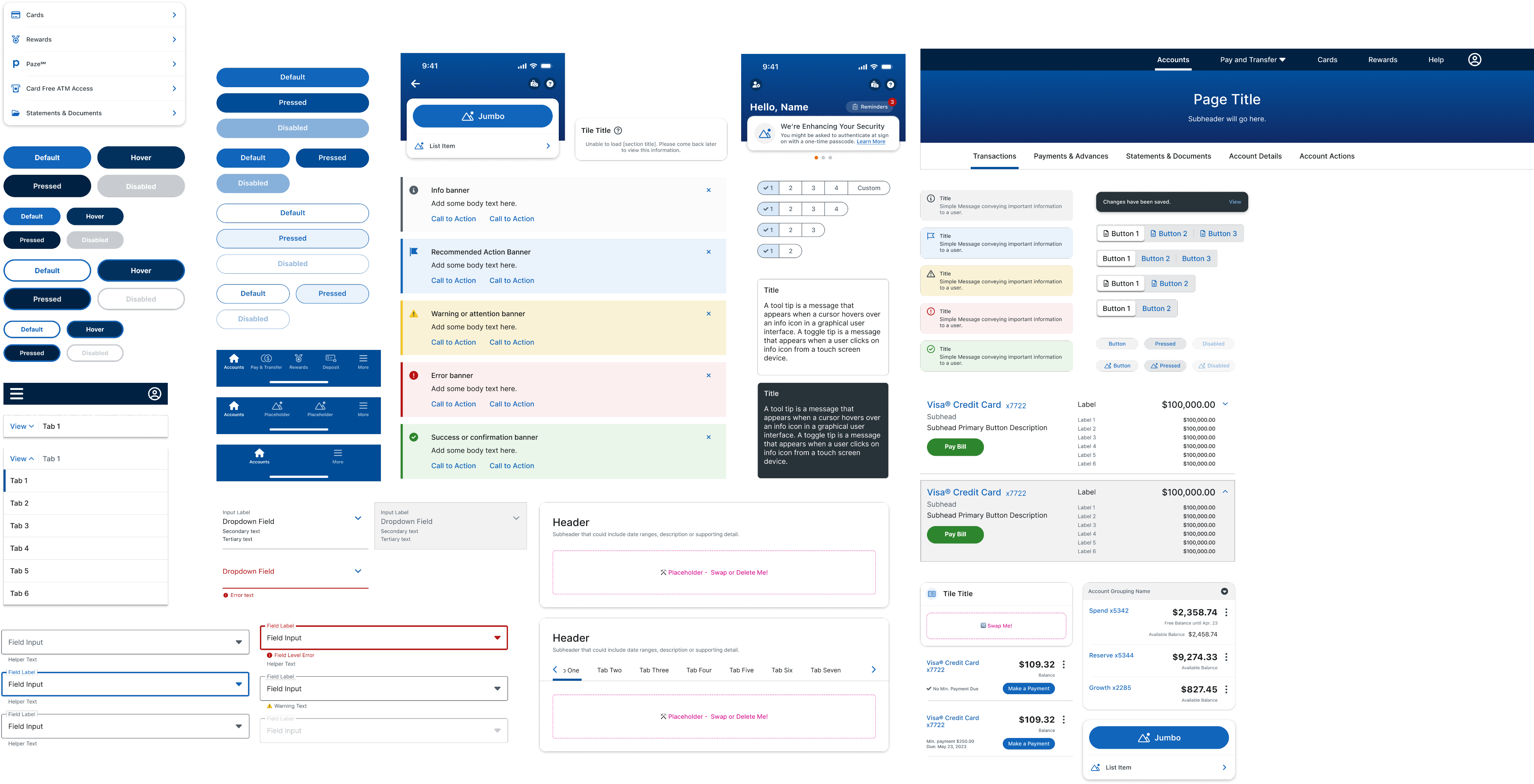
What’s “mobile web view” theming?
The mobile app was undergoing a redesign to modernize and improve the user experience. Due a tight MVP deadline, leadership decided that some features would not be built natively for the first release.
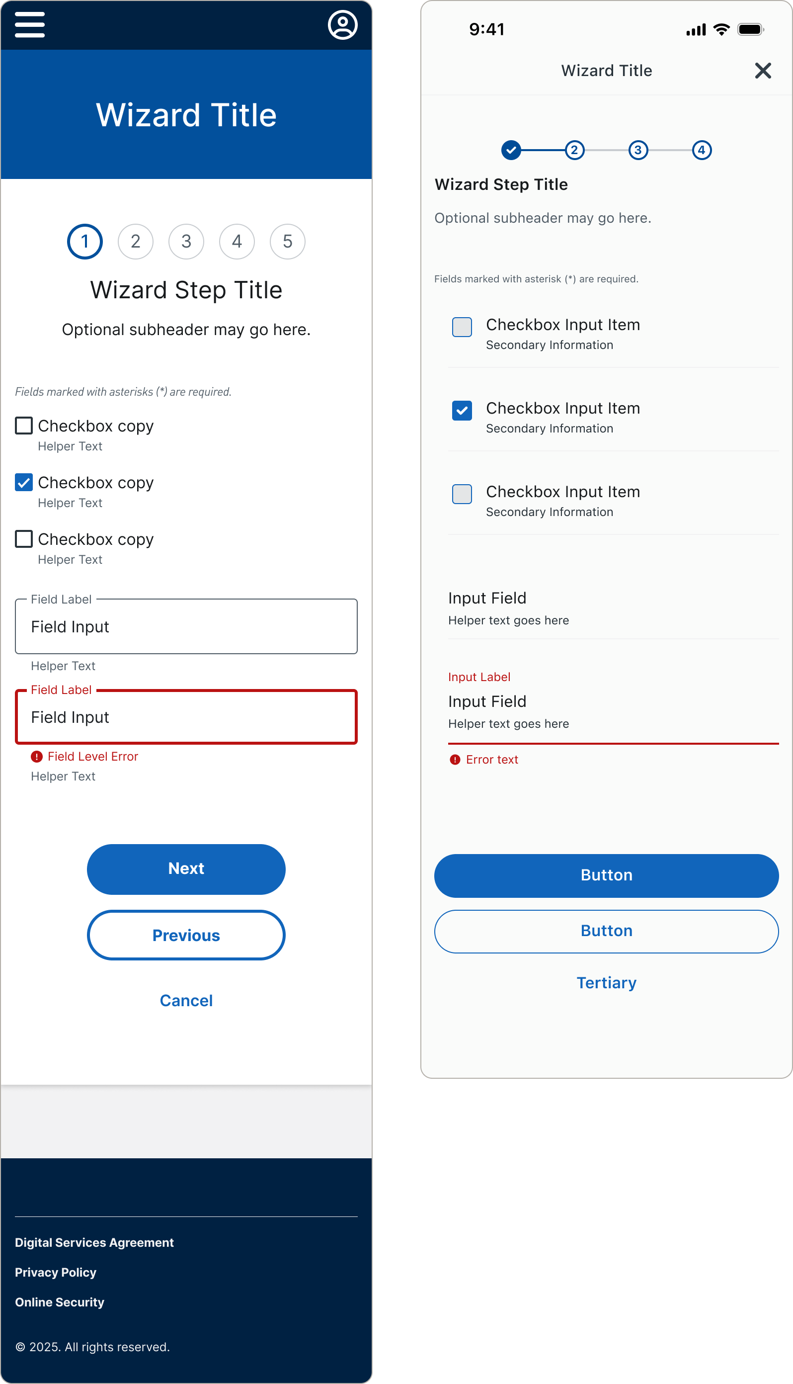
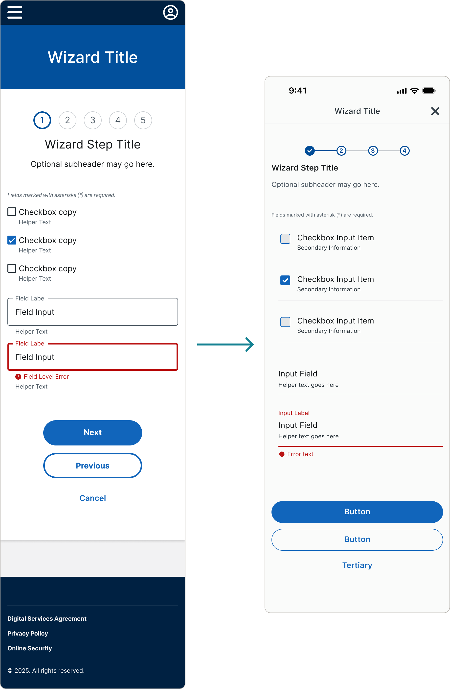
Select user flows from the web experience would be brought into the native mobile app via a light browser within the app known as a web view. Retail components would be styled (themed) to look like mobile components to ensure a more consistent, cohesive experience for mobile app users.
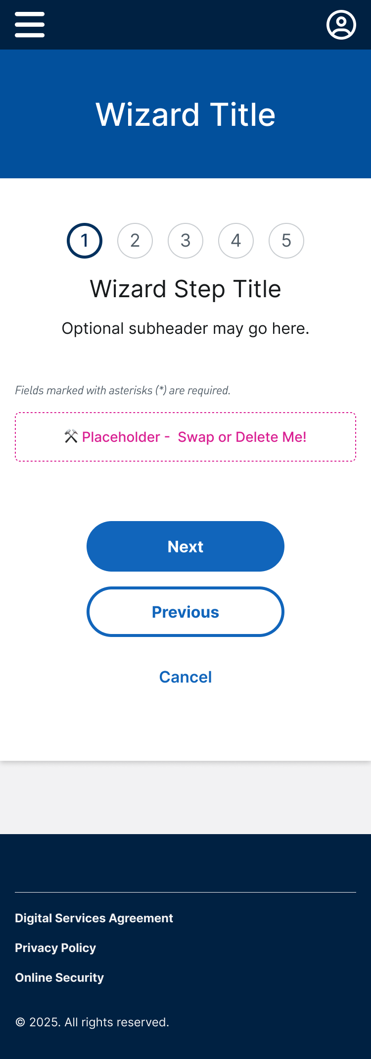
Retail Web Wizard Form
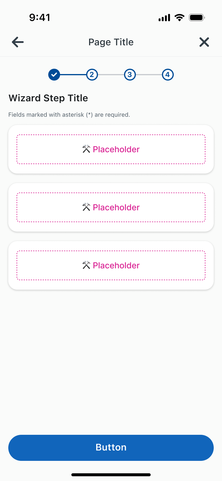
Mobile App Wizard Form
Web View Mobile Themed
Wizard Form
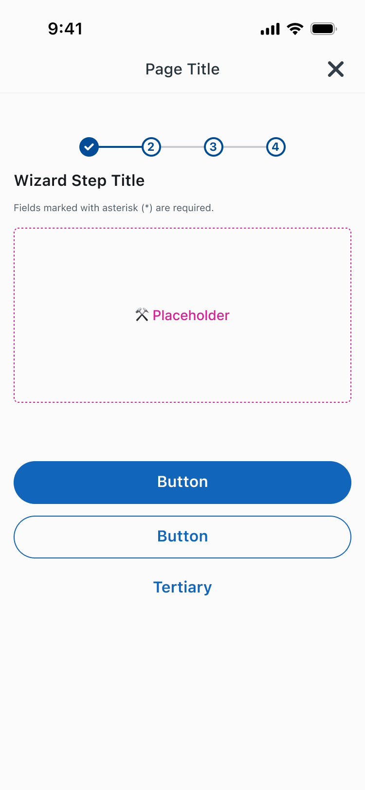
Due to NDA, I am unable to show more content details inside the wizard form components
Results
40+
Themed components built in Sketch and code
25
Components aligned 1:1 to mobile designs
14
Mobile-styled Retail components
I led the end-to-end design process, partnering with 2 systems designers from the Mobile app to ensure the themed component styles aligned to Mobile’s expectations while considering the web component library tech constraints.
The theming project initially started at the end of 2023 but new needs continued to periodically pop up into October 2024. Despite the additional scope, often on short notice, I was able to build Sketch symbols, deliver development specs, and test all components on time.
Container Header
This is the subheader.
🔀 Swap Me!
Container Header
This is the subheader.
Tab 1
Tab 2
Tab 3
Tab 4
Tab 5
Tab 6
🔀 Swap Me!
Input Field
Input Label
Input Field
Error text
Button 1
Button 2
Button 3
Button 1
Button 2
Button
Button
Title
Simple Message conveying important information to a user.
Title
Simple Message conveying important information to a user.
Title
Simple Message conveying important information to a user.
Title
Simple Message conveying important information to a user.
Title
Simple Message conveying important information to a user.
[Feature Name] Unavailable
Please try again later.
Account
(1 Selected)
Checkbox Input Item
Checkbox Input Item
Transaction Type
Date Range
Amount Range
Apply Filters
Cancel
Challenges
Tech constraints prevented the themed components from perfectly matching Mobile components
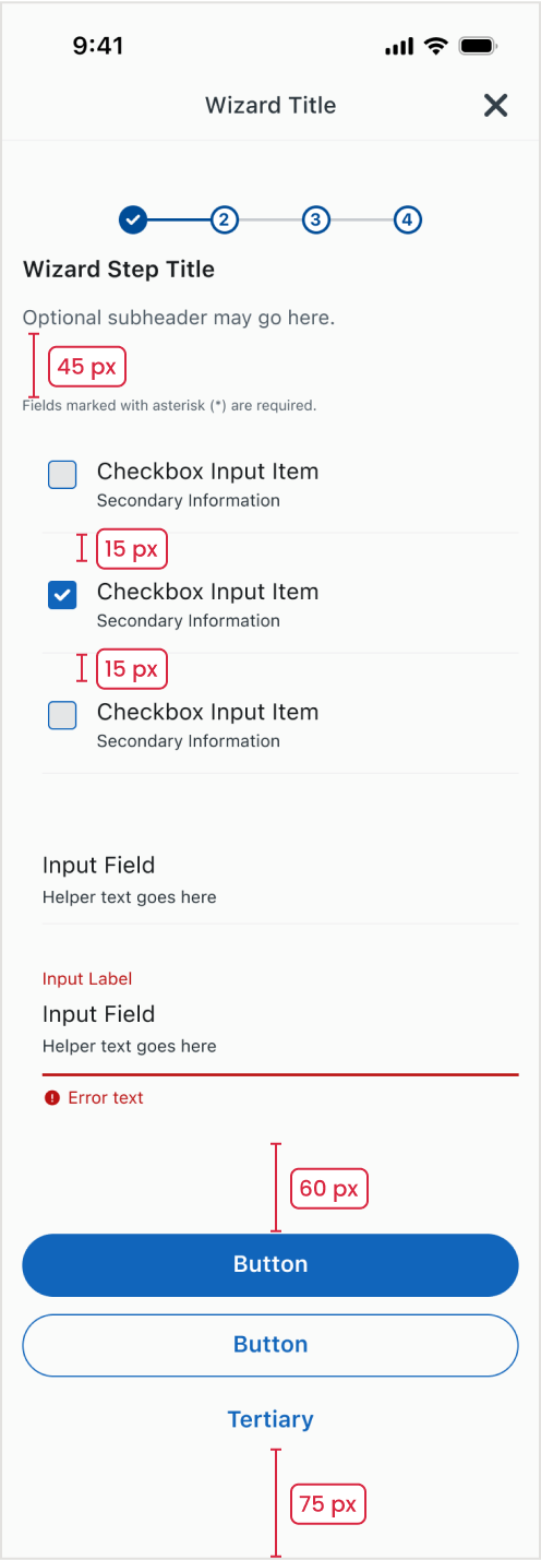
The theming effort was intended to be as automated as possible to avoid extra work for designers and developers. Because of this, the Retail team could not change existing component behavior and functionality to match Mobile components.
Themed Component Scope
In Components
- Typography changes to mobile styling
- Spacing adjusts to mobile standards - mobile uses a 4px grid while retail uses 5px
- Mobile colors are applied
Outside of Components
- Driver app updates font family but not sizing or styling
- Spacing does not change
1
3
Retail Web Wizard Form

2
4
5
Mobile Web View Wizard Form
1
Driver app removes navigation and footer in the themed web view
2
Typography styles are also managed by driver app and switch to Mobile even in non-components
3
Spacing outside of components does not change. Retail uses 5 px grid while Mobile uses 4
4
Retail Angular components are themed to look like Mobile
5
Wizard form container is removed. Background fill is changed to Mobile color.
Communication issues led to a misunderstanding of whether or not we could replicate Mobile component behavior. The Mobile designers were concerned that deviating from the original design would create a jarring user experience.
I navigated these issues by:
- Including developers early on in the design process to ensure components were built within tech limitations. When custom designs were needed due, I referenced the Mobile design system to incorporate existing styles to try to be as consistent as possible.
- Meeting weekly with the Mobile system designers to review specs and ensure they were aware of how tech limitations would affect designs, and collaborating with them to reach a solution.
- Handing off design specs to development only once they had final approval from Mobile.
Frequently changing Mobile designs led to misalignment
The Mobile redesign had kicked off only a few months before the theming project started. Mobile component designs were changing frequently as MVP scope was prioritized. This sometimes made it difficult to get accurate design specs, or designs would change after I gave the specs to development, such as text inputs.
In the chaos of the Mobile app redesign, sometime design updates weren’t communicated so outdated component designs were themed. This resulted in additional tech debt to address later.
Input Field
Helper text goes here
Input Field
Helper text goes here
Error text
Input Label
Input Field
Helper text goes here
Helper text sat within the input field in the original Mobile design but was removed after I handed off the theming specs to dev. This resulted in design discrepancy and additional tech debt.
Scope expanded as new themed components were needed on short notice
The initial scope included approximately 20 components but was later expanded as new features were identified for web view theming. As the only designer on the Retail systems team with visibility into the theming project, I was able to pivot from my other work to prioritize creating dev specs within 2-week sprint deadlines.
Process and Timeline
Timeline
Dec 2023 - March 2024
July 2024
20+ Components in Scope
- Theming was limited to select multi-step wizard form flows
- Components included buttons, text inputs, and notifications
- Mobile styles/colors added to library style sheets
7 Additional Components Needed
- Scope expanded included several non-wizard form screens
- Dark mode theming also added to project scope and previous 20+ components
+2 Components
- Confirmation notification
- Dropdown action list
+4 Components
- Search
- Filter
- Results Container
- Chips
Component Updates
- Design discrepancies will be fixed with Retail component library Material 3 upgrade in Q4 2025
- Additional components?
October 2024
Present
April - May 2024
Scroll to view full timeline
My approach to theming components
01.
Understand design requirements and scope
Leadership determined theming timeline and priority by user flow. The development team created Jira stories that were assigned to 2-week sprints spanning approximately 4 months for the original scope of 20+ components.
Before working on the specs, I reviewed existing Retail flows to understand how the components would be used in context and identify potential gaps missing from scope.
Next, I met with Mobile designers to understand their component usage and behavior, and where there were differences that would be impacted by tech limitations.
02.
Mobile and dev review
I acted as the liaison between the Mobile design system team and Retail web developers to ensure components met design expectations while remaining technically feasible.
Prior to creating designs, I met with Mobile designers to understand component usage and behavior. This helped me identify the approximate Retail equivalent and determine whether or not I would need to update the design to accommodate different functionality.
The step counter is an example of a component where theming only required styling updates.
Step Counter Component
2
3
4
Mobile
2
3
4
Mobile
03.
Initial Designs
To adapt Retail components for mobile use, I created local copies of the Retail Sketch library’s mobile components, modifying them if needed.
I worked on design specs concurrently with Mobile and dev review to ensure specs were delivered on time.
In situations where I had to make design updates, I referenced established Mobile patterns and components when making design updates to maintain consistency.
For example, the Retail dropdown component lacked an equivalent Mobile component, which uses a bottom sheet.
Retail dropdown component
Select Account
Account Heading
Checking x1234
$2,816.12
Free Balance
Checking x5678
$2,816.12
Free Balance
Savings x7402
$2,816.12
Free Balance
Open a New Account
Mobile uses bottom sheets instead of dropdowns
Select Account
Checking x1234
Free Balance: $2,816.12
Checking x5678
Free Balance: $2,816.12
Savings x7402
Free Balance: $2,816.12
Button
Button
Mobile web view themed component
Select Account
Account Heading
Checking x1234
$2,816.12
Free Balance
Checking x5678
$2,816.12
Free Balance
Savings x7402
$2,816.12
Free Balance
Open a New Account
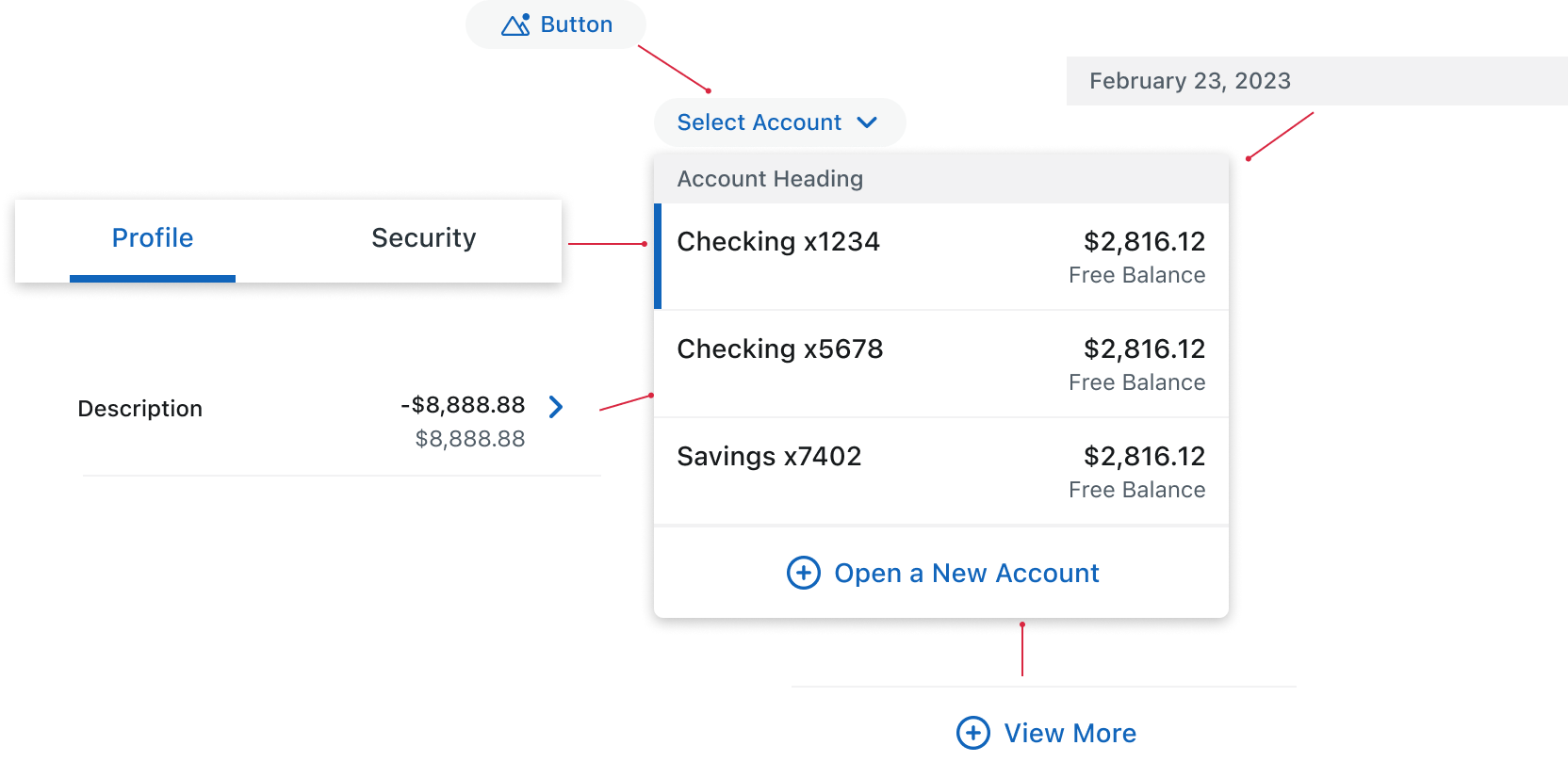
To try to make the component look as close to Mobile as possible, I incorporated styling elements from other components.
Since the theming effort was largely a visual reskin of the Retail Angular components, most existing accessibility features remained intact. My focus was on validating color contrast and touch target sizing for mobile users. Most colors had already passed review with the Mobile accessibility coach, but I identified a contrast issue with error text in dark mode and partnered with the Mobile team to correct it.
04.
Final Design Approval
Before handing off specs to development, I reviewed them weekly with the Mobile team for their final approval, even when the designs were a 1:1 match.
Given the rapid evolution of Mobile, this step was crucial for catching last minute updates to components and ensuring the themed designs stayed up to date.
The timing of the project during a major redesign unfortunately meant this wasn’t always the case, but we were able to capture alignment issues and add them to the backlog to prioritize later.
05.
Dev handoff
After final approval from mobile, I handed off the spec sheets to dev.
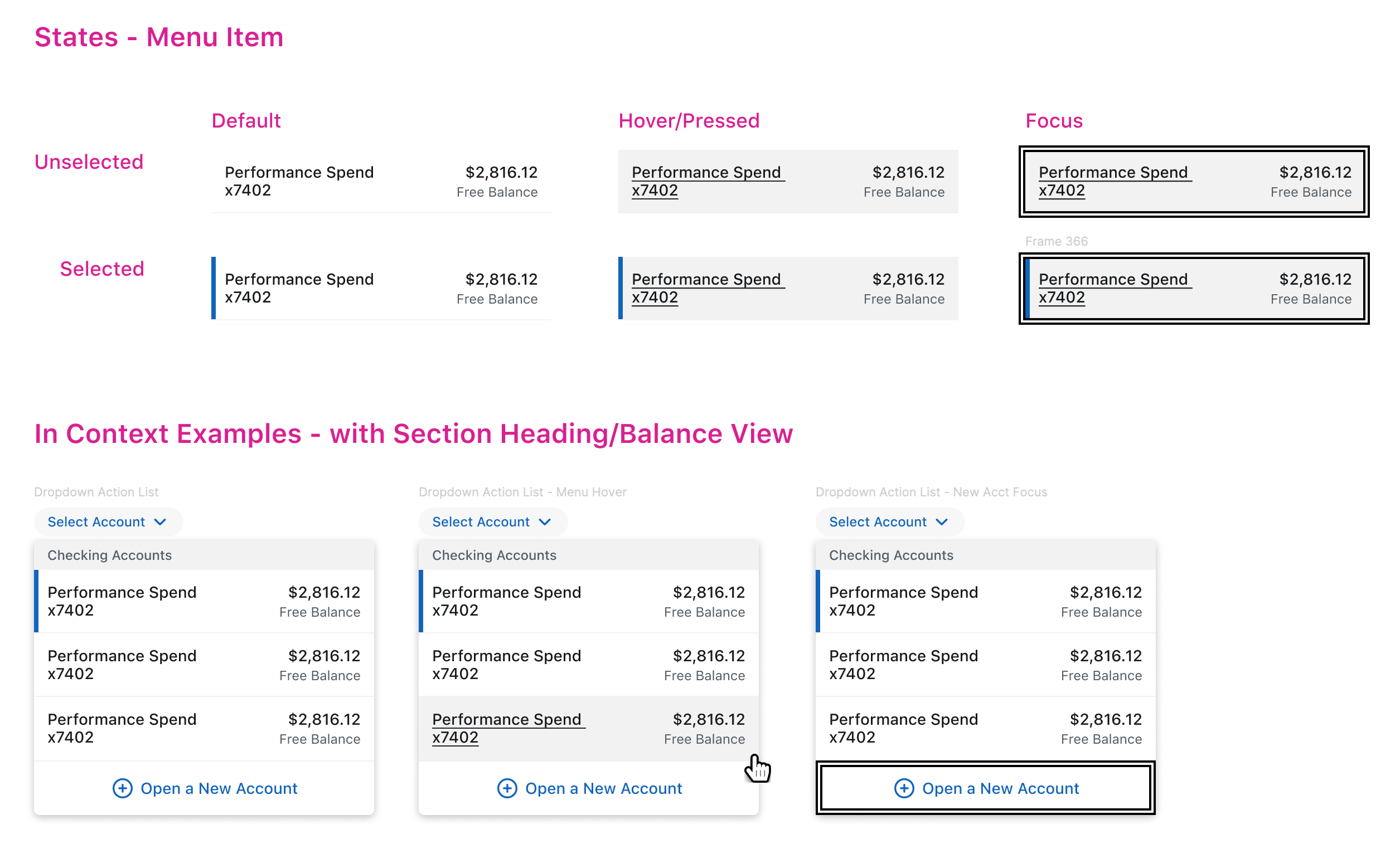
Dropdown action list themed dev specs in Figma. Original specs were completed in Sketch.
06.
Angular component testing
Once the component passed code review and the pull request was merged, I reviewed the component in the RND environment to verify its colors, styling, and behavior aligned with the specs.
I recorded any issues I found in the Jira ticket and retested after feedback was addressed.
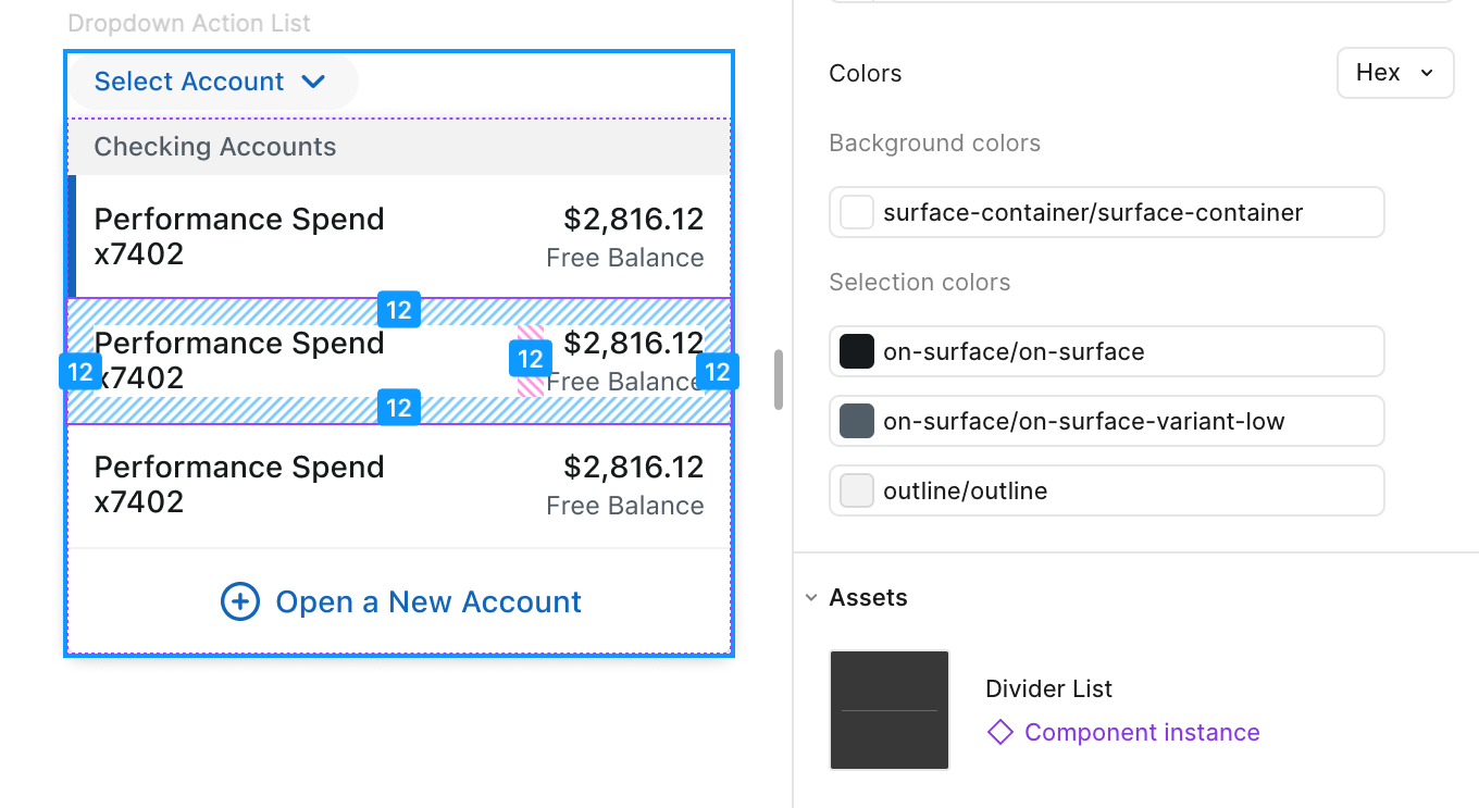
I am unable to provide an example of the QA environment but this Figma Dev Mode screenshot provides a nice visual demonstrating what I tested
07.
Component maintenance and updates
As the Mobile design system evolved, the themed components required ongoing updates to stay aligned. Most of the 30 Retail components, including the themed ones, were built using Google’s Angular Material system.
With an upcoming Angular 18/Material 3 upgrade in Q4 2025, we had the opportunity to resolve design discrepancies between themed and native Mobile components without adding additional tech debt.
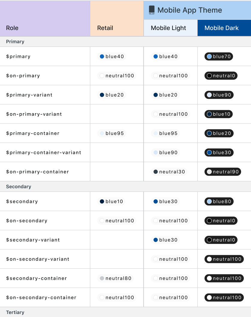
I updated all themed component specs to ensure the latest Mobile design standards could be integrated seamlessly into the upgrade, as well as remap the colors to color role tokens, now implemented in Retail.
Lessons Learned
Collaboration is key to design
Frequent, proactive collaboration with Retail developers and the Mobile team helped surface technical constraints and evolving standards early, reducing rework and ensuring smoother handoffs. Aligning regularly across disciplines was essential for keeping designs feasible and implementation-ready.
Consistency requires strategy and vigilance
Even small updates required referencing core standards and collaborating closely to ensure alignment. Staying consistent across systems meant thinking both holistically and at the component level.
1
Label Only Control
View PDF
2
Button
Button
3
Button
Button
1
Retail Angular Page Control Button component, which enables users to edit or modify content on a page.
2
For the initial theming effort, the Mobile Link Button component was the closest equivalent to the Page Control. Although they had a similar button style (#3), we opted not to use this component for theming because the usage was still undefined.
3
The #2 component usage later was limited to links so we needed to update the themed component to the Micro Button styling, which had a background fill. This change was folded into the Angular Material 3 upgrade.
Upgrades are opportunities for alignment
The timing for the Angular 18 / Material 3 upgrade gave us the chance to close design gaps between the Mobile and Retail themed components without adding much additional tech debt or extra work hours since the themed components would be part of the upgrade either way. This ensured a more seamless user experience from the app to the web view experience.
Company
CGI
|
Client
Top 10 US Bank
|
Some details under NDA
Theming mobile components for
responsive web view
With a tight MVP deadline, the Retail banking app team prioritized speed by rendering select user flows in web view rather than building them natively.
I led the design and delivery of theming web Angular components to align with the new mobile design system, supporting a more consistent user experience and an on-time launch.
Overview
Team
2 Product Owners
6 Developers
Stakeholders
⭐️ Me (Retail UX Designer)
My Role
Senior Product Designer
Timeline
2023-2024
What’s “mobile web view” theming?
The mobile app was undergoing a redesign to modernize and improve the user experience. Due a tight MVP deadline, leadership decided that some features would not be built natively for the first release.
Select user flows from the web experience would be brought into the native mobile app via a light browser within the app known as a web view. Retail components would be styled (themed) to look like mobile components to ensure a more consistent, cohesive experience for mobile app users.
Retail Web Wizard Form

Mobile App Wizard Form

Web View Mobile Themed Wizard Form

Due to NDA, I am unable to show more content details inside the wizard form components
Results
40+
Themed components built in Sketch and code
25
Components aligned 1:1 to mobile designs
14
Mobile-styled Retail components
I led the end-to-end design process, partnering with 2 systems designers from the Mobile app to ensure the themed component styles aligned to Mobile’s expectations while considering the web component library tech constraints.
The theming project initially started at the end of 2023 but new needs continued to periodically pop up into October 2024. Despite the additional scope, often on short notice, I was able to build Sketch symbols, deliver development specs, and test all components on time.
Container Header
This is the subheader.
🔀 Swap Me!
Container Header
This is the subheader.
Tab 1
Tab 2
Tab 3
Tab 4
Tab 5
Tab 6
🔀 Swap Me!
Input Field
Input Label
Input Field
Error text
Button 1
Button 2
Button 3
Button 1
Button 2
Button
Button
Title
Simple Message conveying important information to a user.
Title
Simple Message conveying important information to a user.
Title
Simple Message conveying important information to a user.
Title
Simple Message conveying important information to a user.
Title
Simple Message conveying important information to a user.
[Feature Name] Unavailable
Please try again later.
Account
(1 Selected)
Checkbox Input Item
Checkbox Input Item
Transaction Type
Date Range
Amount Range
Apply Filters
Cancel
Challenges
Tech constraints prevented the themed components from perfectly matching Mobile components
The theming effort was intended to be as automated as possible to avoid extra work for designers and developers. Because of this, the Retail team could not change existing component behavior and functionality to match Mobile components.
Themed Component Scope
In Components
- Typography changes to mobile styling
- Spacing adjusts to mobile standards - mobile uses a 4px grid while retail uses 5px
- Mobile colors are applied
Outside of Components
- Driver app updates font family but not sizing or styling
- Spacing does not change
Retail Web Wizard Form

Driver app removes navigation and footer in the themed web view
Mobile Web View Wizard Form

Spacing outside of components does not change. Retail uses 5 px grid while Mobile uses 4
Typography styles are also managed by driver app and switch to Mobile even in non-components
Retail Angular components are themed to look like Mobile
Wizard form container is removed. Background fill is changed to Mobile color.
Communication issues led to a misunderstanding of whether or not we could replicate Mobile component behavior. The Mobile designers were concerned that deviating from the original design would create a jarring user experience.
I navigated these issues by:
- Including developers early on in the design process to ensure components were built within tech limitations. When custom designs were needed due, I referenced the Mobile design system to incorporate existing styles to try to be as consistent as possible.
- Meeting weekly with the Mobile system designers to review specs and ensure they were aware of how tech limitations would affect designs, and collaborating with them to reach a solution.
- Handing off design specs to development only once they had final approval from Mobile.
Frequently changing Mobile designs led to misalignment
The Mobile redesign had kicked off only a few months before the theming project started. Mobile component designs were changing frequently as MVP scope was prioritized. This sometimes made it difficult to get accurate design specs, or designs would change after I gave the specs to development, such as text inputs.
In the chaos of the Mobile app redesign, sometime design updates weren’t communicated so outdated component designs were themed. This resulted in additional tech debt to address later.
Input Field
Helper text goes here
Input Label
Input Field
Helper text goes here
Input Field
Helper text goes here
Error text
Helper text sat within the input field in the original Mobile design but was removed after I handed off the theming specs to dev. This resulted in design discrepancy and additional tech debt.
Scope expanded as new themed components were needed on short notice
The initial scope included approximately 20 components but was later expanded as new features were identified for web view theming. As the only designer on the Retail systems team with visibility into the theming project, I was able to pivot from my other work to prioritize creating dev specs within 2-week sprint deadlines.
Process and Timeline
Timeline
Dec 2023 - March 2024
July 2024
20+ Components in Scope
- Theming was limited to select multi-step wizard form flows
- Components included buttons, text inputs, and notifications
- Mobile styles/colors added to library style sheets
7 Additional Components Needed
- Scope expanded included several non-wizard form screens
- Dark mode theming also added to project scope and previous 20+ components
+2 Components
- Confirmation notification
- Dropdown action list
+4 Components
- Search
- Filter
- Results Container
- Chips
Component Updates
- Design discrepancies will be fixed with Retail component library Material 3 upgrade in Q4 2025
- Additional components?
October 2024
Present
April - May 2024
Scroll to view full timeline
My approach to theming components
01.
Understand design requirements and scope
Leadership determined theming timeline and priority by user flow. The development team created Jira stories that were assigned to 2-week sprints spanning approximately 4 months for the original scope of 20+ components.
Before working on the specs, I reviewed existing Retail flows to understand how the components would be used in context and identify potential gaps missing from scope.
Next, I met with Mobile designers to understand their component usage and behavior, and where there were differences that would be impacted by tech limitations.
02.
Mobile and dev review
I acted as the liaison between the Mobile design system team and Retail web developers to ensure components met design expectations while remaining technically feasible.
Prior to creating designs, I met with Mobile designers to understand component usage and behavior. This helped me identify the approximate Retail equivalent and determine whether or not I would need to update the design to accommodate different functionality.
The step counter is an example of a component where theming only required styling updates.
Step Counter Component
2
3
4
Retail
2
3
4
Mobile
03.
Initial Designs
To adapt Retail components for mobile use, I created local copies of the Retail Sketch library’s mobile components, modifying them if needed.
I worked on design specs concurrently with Mobile and dev review to ensure specs were delivered on time.
In situations where I had to make design updates, I referenced established Mobile patterns and components when making design updates to maintain consistency.
For example, the Retail dropdown component lacked an equivalent Mobile component, which uses a bottom sheet.
Retail dropdown component
Select Account
Account Heading
Checking x1234
$2,816.12
Free Balance
Checking x5678
$2,816.12
Free Balance
Savings x7402
$2,816.12
Free Balance
Open a New Account
Mobile uses bottom sheets instead of dropdowns
Select Account
Checking x1234
Free Balance: $2,816.12
Checking x5678
Free Balance: $2,816.12
Savings x7402
Free Balance: $2,816.12
Button
Button
Mobile web view themed component
Select Account
Account Heading
Checking x1234
$2,816.12
Free Balance
Checking x5678
$2,816.12
Free Balance
Savings x7402
$2,816.12
Free Balance
Open a New Account
To try to make the component look as close to Mobile as possible, I incorporated styling elements from other components.
Select Account
Account Heading
Checking x1234
$2,816.12
Free Balance
Checking x5678
$2,816.12
Free Balance
Savings x7402
$2,816.12
Free Balance
Open a New Account
Button
February 23, 2023
Description
-$8,888.88
$8,888.88
View More
Profile
Security
Since the theming effort was largely a visual reskin of the Retail Angular components, most existing accessibility features remained intact. My focus was on validating color contrast and touch target sizing for mobile users. Most colors had already passed review with the Mobile accessibility coach, but I identified a contrast issue with error text in dark mode and partnered with the Mobile team to correct it.
04.
Final Design Approval
Before handing off specs to development, I reviewed them weekly with the Mobile team for their final approval, even when the designs were a 1:1 match.
Given the rapid evolution of Mobile, this step was crucial for catching last minute updates to components and ensuring the themed designs stayed up to date.
The timing of the project during a major redesign unfortunately meant this wasn’t always the case, but we were able to capture alignment issues and add them to the backlog to prioritize later.
05.
Dev handoff
After final approval from mobile, I handed off the spec sheets to dev.

Dropdown action list themed dev specs in Figma. Original specs were completed in Sketch.
06.
Angular component testing
Once the component passed code review and the pull request was merged, I reviewed the component in the RND environment to verify its colors, styling, and behavior aligned with the specs.
I recorded any issues I found in the Jira ticket and retested after feedback was addressed.

I am unable to provide an example of the QA environment but this Figma Dev Mode screenshot provides a nice visual demonstrating what I tested
07.
Component maintenance and updates
As the Mobile design system evolved, the themed components required ongoing updates to stay aligned. Most of the 30 Retail components, including the themed ones, were built using Google’s Angular Material system.
With an upcoming Angular 18/Material 3 upgrade in Q4 2025, we had the opportunity to resolve design discrepancies between themed and native Mobile components without adding additional tech debt.
I updated all themed component specs to ensure the latest Mobile design standards could be integrated seamlessly into the upgrade, as well as remap the colors to color role tokens, now implemented in Retail.

Lessons Learned
Collaboration is key to design
Frequent, proactive collaboration with Retail developers and the Mobile team helped surface technical constraints and evolving standards early, reducing rework and ensuring smoother handoffs. Aligning regularly across disciplines was essential for keeping designs feasible and implementation-ready.
Consistency requires strategy and vigilance
Even small updates required referencing core standards and collaborating closely to ensure alignment. Staying consistent across systems meant thinking both holistically and at the component level.
1
Label Only Control
View PDF
2
Button
Button
3
Button
Button
1
Retail Angular Page Control Button component, which enables users to edit or modify content on a page.
2
For the initial theming effort, the Mobile Link Button component was the closest equivalent to the Page Control. Although they had a similar button style (#3), we opted not to use this component for theming because the usage was still undefined.
3
The #2 component usage later was limited to links so we needed to update the themed component to the Micro Button styling, which had a background fill. This change was folded into the Angular Material 3 upgrade.
Upgrades are opportunities for alignment
The timing for the Angular 18 / Material 3 upgrade gave us the chance to close design gaps between the Mobile and Retail themed components without adding much additional tech debt or extra work hours since the themed components would be part of the upgrade either way. This ensured a more seamless user experience from the app to the web view experience.

Company
CGI
|
Client
Top 10 US Bank
|
Some details under NDA
Theming mobile components for
responsive web view
With a tight MVP deadline, the Retail banking app team prioritized speed by rendering select user flows in web view rather than building them natively.
I led the design and delivery of theming web Angular components to align with the new mobile design system, supporting a more consistent user experience and an on-time launch.
Overview
Team
2 Product Owners
6 Developers
Stakeholders
⭐️ Me (Retail UX Designer)
My Role
Senior Product Designer
Timeline
2023-2024
What’s “mobile web view” theming?
The mobile app was undergoing a redesign to modernize and improve the user experience. Due a tight MVP deadline, leadership decided that some features would not be built natively for the first release.
Select user flows from the web experience would be brought into the native mobile app via a light browser within the app known as a web view. Retail components would be styled (themed) to look like mobile components to ensure a more consistent, cohesive experience for mobile app users.
Retail Web Wizard Form

Mobile App Wizard Form

Web View Mobile Themed Wizard Form

Due to NDA, I am unable to show more content details inside the wizard form components
Results
40+
Themed components built in Sketch and code
25
Components aligned 1:1 to mobile designs
14
Mobile-styled Retail components
I led the end-to-end design process, partnering with 2 systems designers from the Mobile app to ensure the themed component styles aligned to Mobile’s expectations while considering the web component library tech constraints.
The theming project initially started at the end of 2023 but new needs continued to periodically pop up into October 2024. Despite the additional scope, often on short notice, I was able to build Sketch symbols, deliver development specs, and test all components on time.
Container Header
This is the subheader.
🔀 Swap Me!
Container Header
This is the subheader.
Tab 1
Tab 2
Tab 3
Tab 4
Tab 5
Tab 6
🔀 Swap Me!
Input Field
Input Label
Input Field
Error text
Button 1
Button 2
Button 3
Button 1
Button 2
Title
Simple Message conveying important information to a user.
Title
Simple Message conveying important information to a user.
Title
Simple Message conveying important information to a user.
Title
Simple Message conveying important information to a user.
Title
Simple Message conveying important information to a user.
Button
Button
[Feature Name] Unavailable
Please try again later.
Account
(1 Selected)
Checkbox Input Item
Checkbox Input Item
Transaction Type
Date Range
Amount Range
Apply Filters
Cancel
Challenges
Tech constraints prevented the themed components from perfectly matching Mobile components
The theming effort was intended to be as automated as possible to avoid extra work for designers and developers. Because of this, the Retail team could not change existing component behavior and functionality to match Mobile components.
Themed Component Scope
In Components
- Typography changes to mobile styling
- Spacing adjusts to mobile standards - mobile uses a 4px grid while retail uses 5px
- Mobile colors are applied
Outside of Components
- Driver app updates font family but not sizing or styling
- Spacing does not change
Retail Web Wizard Form

Driver app removes navigation and footer in the themed web view
Mobile Web View Wizard Form

Spacing outside of components does not change. Retail uses 5 px grid while Mobile uses 4
Typography styles are also managed by driver app and switch to Mobile even in non-components
Retail Angular components are themed to look like Mobile
Wizard form container is removed. Background fill is changed to Mobile color.
Communication issues led to a misunderstanding of whether or not we could replicate Mobile component behavior. The Mobile designers were concerned that deviating from the original design would create a jarring user experience.
I navigated these issues by:
- Including developers early on in the design process to ensure components were built within tech limitations. When custom designs were needed due, I referenced the Mobile design system to incorporate existing styles to try to be as consistent as possible.
- Meeting weekly with the Mobile system designers to review specs and ensure they were aware of how tech limitations would affect designs, and collaborating with them to reach a solution.
- Handing off design specs to development only once they had final approval from Mobile.
Frequently changing Mobile designs led to misalignment
The Mobile redesign had kicked off only a few months before the theming project started. Mobile component designs were changing frequently as MVP scope was prioritized. This sometimes made it difficult to get accurate design specs, or designs would change after I gave the specs to development, such as text inputs.
In the chaos of the Mobile app redesign, sometime design updates weren’t communicated so outdated component designs were themed. This resulted in additional tech debt to address later.
Input Field
Helper text goes here
Input Label
Input Field
Helper text goes here
Input Field
Helper text goes here
Error text
Helper text sat within the input field in the original Mobile design but was removed after I handed off the theming specs to dev. This resulted in design discrepancy and additional tech debt.
Scope expanded as new themed components were needed on short notice
The initial scope included approximately 20 components but was later expanded as new features were identified for web view theming. As the only designer on the Retail systems team with visibility into the theming project, I was able to pivot from my other work to prioritize creating dev specs within 2-week sprint deadlines.
Process and Timeline
Timeline
Dec 2023 - March 2024
July 2024
20+ Components in Scope
- Theming was limited to select multi-step wizard form flows
- Components included buttons, text inputs, and notifications
- Mobile styles/colors added to library style sheets
7 Additional Components Needed
- Scope expanded included several non-wizard form screens
- Dark mode theming also added to project scope and previous 20+ components
+2 Components
- Confirmation notification
- Dropdown action list
+4 Components
- Search
- Filter
- Results Container
- Chips
Component Updates
- Design discrepancies will be fixed with Retail component library Material 3 upgrade in Q4 2025
- Additional components?
October 2024
Present
April - May 2024
My approach to theming components
01.
Understand design requirements and scope
Leadership determined theming timeline and priority by user flow. The development team created Jira stories that were assigned to 2-week sprints spanning approximately 4 months for the original scope of 20+ components.
Before working on the specs, I reviewed existing Retail flows to understand how the components would be used in context and identify potential gaps missing from scope.
Next, I met with Mobile designers to understand their component usage and behavior, and where there were differences that would be impacted by tech limitations.
02.
Mobile and dev review
I acted as the liaison between the Mobile design system team and Retail web developers to ensure components met design expectations while remaining technically feasible.
Prior to creating designs, I met with Mobile designers to understand component usage and behavior. This helped me identify the approximate Retail equivalent and determine whether or not I would need to update the design to accommodate different functionality.
The step counter is an example of a component where theming only required styling updates.
Step Counter Component
2
3
4
Retail
2
3
4
Mobile
03.
Initial Designs
To adapt Retail components for mobile use, I created local copies of the Retail Sketch library’s mobile components, modifying them if needed.
I worked on design specs concurrently with Mobile and dev review to ensure specs were delivered on time.
In situations where I had to make design updates, I referenced established Mobile patterns and components when making design updates to maintain consistency.
For example, the Retail dropdown component lacked an equivalent Mobile component, which uses a bottom sheet.
Retail dropdown component
Select Account
Account Heading
Checking x1234
$2,816.12
Free Balance
Checking x5678
$2,816.12
Free Balance
Savings x7402
$2,816.12
Free Balance
Open a New Account
Mobile uses bottom sheets instead of dropdowns
Select Account
Checking x1234
Free Balance: $2,816.12
Checking x5678
Free Balance: $2,816.12
Savings x7402
Free Balance: $2,816.12
Button
Button
Mobile web view themed component
Select Account
Account Heading
Checking x1234
$2,816.12
Free Balance
Checking x5678
$2,816.12
Free Balance
Savings x7402
$2,816.12
Free Balance
Open a New Account
To try to make the component look as close to Mobile as possible, I incorporated styling elements from other components.
Select Account
Account Heading
Checking x1234
$2,816.12
Free Balance
Checking x5678
$2,816.12
Free Balance
Savings x7402
$2,816.12
Free Balance
Open a New Account
Button
February 23, 2023
Description
-$8,888.88
$8,888.88
View More
Profile
Security
Since the theming effort was largely a visual reskin of the Retail Angular components, most existing accessibility features remained intact. My focus was on validating color contrast and touch target sizing for mobile users. Most colors had already passed review with the Mobile accessibility coach, but I identified a contrast issue with error text in dark mode and partnered with the Mobile team to correct it.
04.
Final Design Approval
Before handing off specs to development, I reviewed them weekly with the Mobile team for their final approval, even when the designs were a 1:1 match.
Given the rapid evolution of Mobile, this step was crucial for catching last minute updates to components and ensuring the themed designs stayed up to date.
The timing of the project during a major redesign unfortunately meant this wasn’t always the case, but we were able to capture alignment issues and add them to the backlog to prioritize later.
05.
Dev handoff
After final approval from mobile, I handed off the spec sheets to dev.

Dropdown action list themed dev specs in Figma. Original specs were completed in Sketch.
06.
Angular component testing
Once the component passed code review and the pull request was merged, I reviewed the component in the RND environment to verify its colors, styling, and behavior aligned with the specs.
I recorded any issues I found in the Jira ticket and retested after feedback was addressed.

I am unable to provide an example of the QA environment but this Figma Dev Mode screenshot provides a nice visual demonstrating what I tested
07.
Component maintenance and updates
As the Mobile design system evolved, the themed components required ongoing updates to stay aligned. Most of the 30 Retail components, including the themed ones, were built using Google’s Angular Material system.
With an upcoming Angular 18/Material 3 upgrade in Q4 2025, we had the opportunity to resolve design discrepancies between themed and native Mobile components without adding additional tech debt.
I updated all themed component specs to ensure the latest Mobile design standards could be integrated seamlessly into the upgrade, as well as remap the colors to color role tokens, now implemented in Retail.

Lessons Learned
Collaboration is key to design
Frequent, proactive collaboration with Retail developers and the Mobile team helped surface technical constraints and evolving standards early, reducing rework and ensuring smoother handoffs. Aligning regularly across disciplines was essential for keeping designs feasible and implementation-ready.
Consistency requires strategy and vigilance
Even small updates required referencing core standards and collaborating closely to ensure alignment. Staying consistent across systems meant thinking both holistically and at the component level.
1
Label Only Control
View PDF
2
Button
Button
3
Button
Button
1
Retail Angular Page Control Button component, which enables users to edit or modify content on a page.
2
For the initial theming effort, the Mobile Link Button component was the closest equivalent to the Page Control. Although they had a similar button style (#3), we opted not to use this component for theming because the usage was still undefined.
3
The #2 component usage later was limited to links so we needed to update the themed component to the Micro Button styling, which had a background fill. This change was folded into the Angular Material 3 upgrade.
Upgrades are opportunities for alignment
The timing for the Angular 18 / Material 3 upgrade gave us the chance to close design gaps between the Mobile and Retail themed components without adding much additional tech debt or extra work hours since the themed components would be part of the upgrade either way. This ensured a more seamless user experience from the app to the web view experience.
